@david-farkas
active 2 years ago-

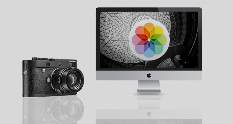
David Farkas wrote a new post, Apple Issues OS X Yosemite Update to Fix Photos App Issues with Leica M246 DNG Files 10 years, 5 months ago
Apple delivered a fix to their Photos App in the latest OS X Yosemite 10.10.4 Update. This addresses the problem of the Photos App or Aperture crashing when trying to import Leica M Monochrom (Typ 246) DNG files. […]
-
David Farkas commented on the post, Leica Q (Typ 116) Review: A Full-Frame Mini M 10 years, 6 months ago
In reply to: David Farkas wrote a new post, Leica Q (Typ 116) Review: A Full-Frame Mini M Back when the X Vario was introduced and initially teased as a mini M, many were disappointed. The X Vario (Typ 107) ended up being a great camera, an X with a zoom, and a stellar zoom lens at that, but certainly […] View
View
I did use the lens profile for the 28mm Summicron-M ASPH in Lightroom, since the Q hasn't been added to the lens database yet.
-
David Farkas commented on the post, Leica Q (Typ 116) Review: A Full-Frame Mini M 10 years, 6 months ago
In reply to: David Farkas wrote a new post, Leica Q (Typ 116) Review: A Full-Frame Mini M Back when the X Vario was introduced and initially teased as a mini M, many were disappointed. The X Vario (Typ 107) ended up being a great camera, an X with a zoom, and a stellar zoom lens at that, but certainly […] View
In the current Q firmware, you cannot move the magnified focus point. Given that the S007 running the same Maestro 2 processor will support this feature, a future firmware update might allow it. We'll have to see.
-
David Farkas commented on the post, Leica Q (Typ 116) Review: A Full-Frame Mini M 10 years, 6 months ago
In reply to: David Farkas wrote a new post, Leica Q (Typ 116) Review: A Full-Frame Mini M Back when the X Vario was introduced and initially teased as a mini M, many were disappointed. The X Vario (Typ 107) ended up being a great camera, an X with a zoom, and a stellar zoom lens at that, but certainly […] View
Interesting idea on the electronic shutter. The leaf shutter is so quiet and introduces so little vibration, I'm not sure if there would be any advantage here.
As far as the ad-hoc connection, this is already available. A QR code on the camera's LCD is generated when using “Host” mode WLAN setup. Scan the QR code with the Q App on your phone or…[Read more]
-
David Farkas commented on the post, Leica Q (Typ 116) Review: A Full-Frame Mini M 10 years, 6 months ago
In reply to: David Farkas wrote a new post, Leica Q (Typ 116) Review: A Full-Frame Mini M Back when the X Vario was introduced and initially teased as a mini M, many were disappointed. The X Vario (Typ 107) ended up being a great camera, an X with a zoom, and a stellar zoom lens at that, but certainly […] View
No, this is a pure Leica product. My understanding is that Panasonic's involvement was limited to specific components, such as AF and OIS.
-
David Farkas commented on the post, Leica Q (Typ 116) Review: A Full-Frame Mini M 10 years, 6 months ago
In reply to: David Farkas wrote a new post, Leica Q (Typ 116) Review: A Full-Frame Mini M Back when the X Vario was introduced and initially teased as a mini M, many were disappointed. The X Vario (Typ 107) ended up being a great camera, an X with a zoom, and a stellar zoom lens at that, but certainly […] View
Image quality on both M240/28 Lux and the Q will be quite good and fairly comparable. I haven't done any head to head testing yet, but I did just wrap up a workshop in Berlin where I shot with both cameras side-by-side. The results in LR are mixed together and match up very nicely.
The real advantage of the M is the flexibility to use other…[Read more]
-
David Farkas commented on the post, Leica M Monochrom (Typ 246) Review 10 years, 6 months ago
In reply to: David Farkas wrote a new post, Leica M Monochrom (Typ 246) Review Many in the photographic community have speculated that it was only a matter of time until Leica made a monochrome version of the M (Typ 240), more commonly known as the M240. The original M Monochrom, perhaps now […] View
View
Some shots were manually set, but most were shot with Auto ISO, using Aperture priority.
-
David Farkas wrote a new post, Leica Q (Typ 116) Review: A Full-Frame Mini M 10 years, 6 months ago
Back when the X Vario was introduced and initially teased as a mini M, many were disappointed. The X Vario (Typ 107) ended up being a great camera, an X with a zoom, and a stellar zoom lens at that, but certainly […]
-
David Farkas wrote a new post, B&W ISO Showdown: Leica M Monochrom (Typ 246) vs. M Monochrom (M9) vs. M (Typ 240) 10 years, 6 months ago
During my testing of the new Leica M Monochrom (Typ 246) in NYC and New Orleans, I was blown away by the camera's high ISO ability, so I wanted to see how it stacked up against the original M Monochrom based off o […]
-
While controlled ISO testing like this doesn't directly impact “taking pictures” per se, it does let users or potential users understand the performance envelope of this camera vs. other cameras. I suppose the same argument could be made as to why car reviewers measure 0-60 times and lateral acceleration, among other benchmarks. They are a good measure of relative performance. Personally, I do prefer going out and shooting actual pictures. If you read my Leica M Monochrom (Typ 246) Review, you'll see I have no shortage of real-life pictures taken in a variety of situations.
-
-
David Farkas commented on the post, Leica M Monochrom (Typ 246) Review 10 years, 6 months ago
In reply to: David Farkas wrote a new post, Leica M Monochrom (Typ 246) Review Many in the photographic community have speculated that it was only a matter of time until Leica made a monochrome version of the M (Typ 240), more commonly known as the M240. The original M Monochrom, perhaps now […] View
Did you try to turn off lens profile corrections in LR?
We first discovered a strange behavior in LR when processing M9M files a couple years ago when using lens profile corrections. Seems that there is sometimes some pattern noise introduced in B&W images with pulled up shadows. What was even stranger was that the artifacts were only visible…[Read more]
-
David Farkas commented on the post, The Great Debate: CCD vs. CMOS – Part 3 10 years, 6 months ago
In reply to: David Farkas wrote a new post, The Great Debate: CCD vs. CMOS - Part 3 The results are in! Thanks so much to everyone who cast their votes in both Part 1 and Part 2 of this experiment. The Experiment To recap, I was testing the theory that images from a Leica CCD-based camera have a unique and instantly identifiable look and feel to the images. Many who hold this belief feel that this look cannot be achieved with a CMOS-based camera, regardless of post-processing efforts. To conduct the test, I ventured out with both an M9 and an M240 while I was visiting San Francisco with my family for a couple of days at the end of February. After taking an image with one camera, I’d quickly swap lenses to shoot roughly the same picture with the other body using the same lens and equivalent settings. Part 1: Head-to-Head Comparisons For Part 1, I first processed the M9 files to look like what I’d expect M9 images to look like using my preset and personal preference. I then used the M9 images as a reference to adjust the corresponding M240 files and tried to achieve a rough match. Rather than use all the tools at my disposal to create an exact match, I opted instead to impose some limits. In the spirit of the experiment, I wanted to see if a match could be achieved without using any localized adjustments. No masking. No selections. No adjustment or gradient brushes. Instead, I used only overall image slider adjustments in Adobe Lightroom. After all, this test was not about how good my post processing skills are when given any and all tools and unlimited time. I wanted it to be realistic so that almost anyone with moderate Lightroom skills could produce the same results as I did. The pairs were then posted without metadata and were randomized in the order displayed. Part 1: The Results The results were certainly interesting. On the direct comparisons in Part 1, only 7 out of 19 (36%) match-ups were correctly identified. This is pretty telling. I received feedback from some users that they started taking the test and just gave up halfway through as they couldn’t see any significant differences and felt they were merely guessing. This is visible in the voting numbers, with almost 800 votes for the first set and about 450 for the last set (as of this writing). There were some surprises for me, though. I was amazed that so many were able to accurately identify the M9 images in the Streetcar and Apartment sets. Roughly two thirds of the voters picked correctly on these. On the flip side, I was equally stunned that so many guessed incorrectly on two images which I felt were bound to be easier to pick due to their color ranges: Red Cards and Lombard Street. Most other pairs of images came in very close to 50/50. Keep in mind that this test wasn’t to determine which camera was more capable. It was to merely test the “CCD look” theory. The conditions purposely favored the M9, as the comparisons featured images taken in good quality, directional natural light with vibrant colors, and defined contrast. These kinds of punchy images at low ISO almost always look great from the M9. Here are the raw voting results as of March 6, 2015: Thumbnail Which one was M9? Votes M9 M240 Margin Correct? Streetcar - 1
796
60.7%
39.3%
21.4%
Yes
Streetcar - 1
796
60.7%
39.3%
21.4%
Yes
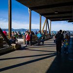
 Fishing Dock -1
735
56.1%
43.9%
12.2%
Yes
Fishing Dock -1
735
56.1%
43.9%
12.2%
Yes
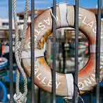 Life Preserver - 1
703
56.3%
43.7%
12.6%
Yes
Life Preserver - 1
703
56.3%
43.7%
12.6%
Yes
 Fishing Boat Bows - 2
670
47.6%
52.4%
-4.8%
No
Fishing Boat Bows - 2
670
47.6%
52.4%
-4.8%
No
 Bay Boat Tour - 2
620
46.5%
53.5%
-7.0%
No
Bay Boat Tour - 2
620
46.5%
53.5%
-7.0%
No
 Sailboats in front of Alcatraz - 1
563
46.7%
53.3%
-6.6%
No
Sailboats in front of Alcatraz - 1
563
46.7%
53.3%
-6.6%
No
 Magenta Tulips - 1
557
49.2%
50.8%
-1.6%
No
Magenta Tulips - 1
557
49.2%
50.8%
-1.6%
No
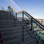 Steps - 2
533
47.5%
52.5%
-5.0%
No
Steps - 2
533
47.5%
52.5%
-5.0%
No
 Pier 39 - 1
518
54.2%
45.8%
8.4%
Yes
Pier 39 - 1
518
54.2%
45.8%
8.4%
Yes
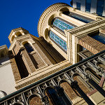 Church Windows - 2
505
49.9%
50.1%
-0.2%
No
Church Windows - 2
505
49.9%
50.1%
-0.2%
No
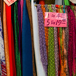 Scarves - 1
489
52.6%
47.4%
5.2%
Yes
Scarves - 1
489
52.6%
47.4%
5.2%
Yes
 Red Cards in Bin - 2
460
43.0%
57.0%
-14.0%
No
Red Cards in Bin - 2
460
43.0%
57.0%
-14.0%
No
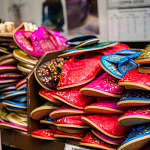 Slippers - 2
450
45.8%
54.2%
-8.4%
No
Slippers - 2
450
45.8%
54.2%
-8.4%
No
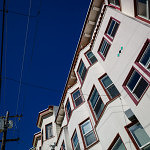
 Skyscraper - 1
443
46.5%
53.5%
-7.0%
No
Skyscraper - 1
443
46.5%
53.5%
-7.0%
No
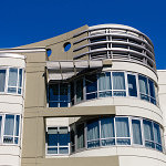 Modern Building - 2
438
47.5%
52.5%
-5.0%
No
Modern Building - 2
438
47.5%
52.5%
-5.0%
No
 Gate - 2
430
48.8%
51.2%
-2.4%
No
Gate - 2
430
48.8%
51.2%
-2.4%
No
 Apartments - 1
418
62.7%
37.3%
25.4%
Yes
Apartments - 1
418
62.7%
37.3%
25.4%
Yes
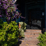 Walkway with Purple Flowers - 2
437
51.9%
48.1%
3.8%
Yes
Walkway with Purple Flowers - 2
437
51.9%
48.1%
3.8%
Yes
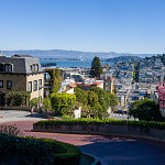 Lombard Street - 2
458
42.4%
57.6%
-15.2%
No
Part 2: Single Images
For Part 2, I wanted to take a slightly different approach. I was on vacation and as such, didn’t shoot soley for the sake of making image comparison sets. At a certain point, this kind of shooting gets fairly tedious. Once I knew I had enough material for the test, I just focused on having fun taking pictures like I would normally do in a great shooting locale like San Francisco on a gorgeous day.
For these single images, I processed with respective presets for each camera and my personal taste, picked some of my favorites and posted individual photos. The challenge this time was to correctly identify which camera was used to produce each image. And because, for me, the head-to-head test was over, I allowed myself to seek out a broader range of subjects and more candid scenarios that didn’t only suit the M9. Shots were taken at night, at high ISO, and indoors under artificial lighting. As indicated by the votes on the images, most people erred on the side of picking the M240 for these types of shots. And even with these obvious examples, only 55% of the images were correctly identified. I will say, though, that swings in preferences were much more pronounced than in the head-to-head comparisons of Part 1.
Part 2: The Results I didn’t set out to make this a segment full of trick questions, but unfortunately, I only had two images from the M9 during my free shooting time that I felt were worthwhile to post. Why? Well, frankly, the M240 was more fun to shoot with, so that’s what I used for 90% of my shooting even though I carried both cameras with me. It’s faster. I can use the EVF for precise composition. The LCD screen allows more accurate review. And, ironically, the CMOS sensor fares far better in poor and mixed light and is vastly superior for high ISO shooting. So, if you voted/guessed that every image was taken with the M240 you’d have scored way, way above the average. Here are the raw voting results, again from March 6, 2015: Votes M9 M240 Margin Correct? Which Camera? Cigar Store Café 314 41.4% 58.6% 17.2% Y M240 Washington Square Park 300 62.3% 37.7% -24.6% N M240 Julie on Cable Car 303 30.7% 69.3% 38.6% Y M240 Yellow Tulips 280 45.0% 55.0% 10.0% N M240 Two Guys at the Pier 281 62.6% 37.4% 25.2% Y M9 Red and White Fleet Sign 272 45.6% 54.4% -8.8% N M9 Red Light Gauges 258 33.7% 66.3% 32.6% Y M240 Old Dial pn Sub 261 41.8% 58.2% 16.4% Y M240 Sub Engine Gauges 256 55.9% 44.1% -11.8% N M240 Battle Telephone 243 46.5% 53.5% 7.0% Y M240 SS-383 Conning Tower 251 58.2% 41.8% -16.4% N M240 Leaving Museum 243 62.6% 37.4% -25.2% N M240 Pier at Sunset 253 35.6% 64.4% 28.8% Y M240 Ghiradelli Square at Night 246 48.4% 51.6% 3.2% Y M240 Sunset on the Beach 239 56.9% 43.1% -13.8% N M240 Sophia with Hat 245 37.6% 62.4% 24.8% Y M240 Angled Street 228 45.2% 54.8% 9.6% Y M240 City View out of Round Window 221 62.4% 37.6% -24.8% N M240 Coit Tower Windows 224 57.6% 42.4% -15.2% N M240 Coit Tower Looking Up 223 40.8% 59.2% 18.4% Y M240 Red Car 227 51.1% 48.9% -2.2% N M240 Modern House on Lombard 222 60.8% 39.2% -21.6% N M240 Loading Bay 218 44.0% 56.0% 12.0% Y M240 Parking 217 42.4% 57.6% 15.2% Y M240 Hallway 199 43.7% 56.3% 12.6% Y M240 Fishmonger 206 50.5% 49.5% -1.0% N M240 Drydock 203 40.9% 59.1% 18.2% Y M240 The Embarcadero 200 55.5% 44.5% -11.0% N M240 Roll Your Own 207 59.9% 40.1% -19.8% N M240 Red Door 205 47.3% 52.7% 5.4% Y M240 Shadow Tree 217 56.7% 43.3% -13.4% N M240 Admittedly, many of the M240 images do indeed look like they were taken with the M9. This wasn’t because I was trying to play games or fool anyone. The files ended up this way because I liked the way they looked. Remember, on these images I didn’t have a known aim point. Processing, for me, as I imagine for many other photographers, is highly personal and subjective. Very, very few areas of photography benefit from “accurate” color or tone. Almost all disciplines of our fair art form take liberties to represent our own unique visions. Even before digital, we used filters to alter color or contrast, shot various film types with no two emulsions offering the same visual fingerprint, employed different chemistry to achieve a specific look, and messed around in the darkroom for hours to create our desired finished vision. I make no apologies for editing my images to suit my tastes. And, furthermore, I think that the pursuit of a mythical “accurate” or “neutral” result out of camera with no processing doesn’t jive with the most basic tenets of photography, be it film or digital. This quixotic quest, while appearing reasonable and noble, doesn’t make better photographs. But I digress.
Lombard Street - 2
458
42.4%
57.6%
-15.2%
No
Part 2: Single Images
For Part 2, I wanted to take a slightly different approach. I was on vacation and as such, didn’t shoot soley for the sake of making image comparison sets. At a certain point, this kind of shooting gets fairly tedious. Once I knew I had enough material for the test, I just focused on having fun taking pictures like I would normally do in a great shooting locale like San Francisco on a gorgeous day.
For these single images, I processed with respective presets for each camera and my personal taste, picked some of my favorites and posted individual photos. The challenge this time was to correctly identify which camera was used to produce each image. And because, for me, the head-to-head test was over, I allowed myself to seek out a broader range of subjects and more candid scenarios that didn’t only suit the M9. Shots were taken at night, at high ISO, and indoors under artificial lighting. As indicated by the votes on the images, most people erred on the side of picking the M240 for these types of shots. And even with these obvious examples, only 55% of the images were correctly identified. I will say, though, that swings in preferences were much more pronounced than in the head-to-head comparisons of Part 1.
Part 2: The Results I didn’t set out to make this a segment full of trick questions, but unfortunately, I only had two images from the M9 during my free shooting time that I felt were worthwhile to post. Why? Well, frankly, the M240 was more fun to shoot with, so that’s what I used for 90% of my shooting even though I carried both cameras with me. It’s faster. I can use the EVF for precise composition. The LCD screen allows more accurate review. And, ironically, the CMOS sensor fares far better in poor and mixed light and is vastly superior for high ISO shooting. So, if you voted/guessed that every image was taken with the M240 you’d have scored way, way above the average. Here are the raw voting results, again from March 6, 2015: Votes M9 M240 Margin Correct? Which Camera? Cigar Store Café 314 41.4% 58.6% 17.2% Y M240 Washington Square Park 300 62.3% 37.7% -24.6% N M240 Julie on Cable Car 303 30.7% 69.3% 38.6% Y M240 Yellow Tulips 280 45.0% 55.0% 10.0% N M240 Two Guys at the Pier 281 62.6% 37.4% 25.2% Y M9 Red and White Fleet Sign 272 45.6% 54.4% -8.8% N M9 Red Light Gauges 258 33.7% 66.3% 32.6% Y M240 Old Dial pn Sub 261 41.8% 58.2% 16.4% Y M240 Sub Engine Gauges 256 55.9% 44.1% -11.8% N M240 Battle Telephone 243 46.5% 53.5% 7.0% Y M240 SS-383 Conning Tower 251 58.2% 41.8% -16.4% N M240 Leaving Museum 243 62.6% 37.4% -25.2% N M240 Pier at Sunset 253 35.6% 64.4% 28.8% Y M240 Ghiradelli Square at Night 246 48.4% 51.6% 3.2% Y M240 Sunset on the Beach 239 56.9% 43.1% -13.8% N M240 Sophia with Hat 245 37.6% 62.4% 24.8% Y M240 Angled Street 228 45.2% 54.8% 9.6% Y M240 City View out of Round Window 221 62.4% 37.6% -24.8% N M240 Coit Tower Windows 224 57.6% 42.4% -15.2% N M240 Coit Tower Looking Up 223 40.8% 59.2% 18.4% Y M240 Red Car 227 51.1% 48.9% -2.2% N M240 Modern House on Lombard 222 60.8% 39.2% -21.6% N M240 Loading Bay 218 44.0% 56.0% 12.0% Y M240 Parking 217 42.4% 57.6% 15.2% Y M240 Hallway 199 43.7% 56.3% 12.6% Y M240 Fishmonger 206 50.5% 49.5% -1.0% N M240 Drydock 203 40.9% 59.1% 18.2% Y M240 The Embarcadero 200 55.5% 44.5% -11.0% N M240 Roll Your Own 207 59.9% 40.1% -19.8% N M240 Red Door 205 47.3% 52.7% 5.4% Y M240 Shadow Tree 217 56.7% 43.3% -13.4% N M240 Admittedly, many of the M240 images do indeed look like they were taken with the M9. This wasn’t because I was trying to play games or fool anyone. The files ended up this way because I liked the way they looked. Remember, on these images I didn’t have a known aim point. Processing, for me, as I imagine for many other photographers, is highly personal and subjective. Very, very few areas of photography benefit from “accurate” color or tone. Almost all disciplines of our fair art form take liberties to represent our own unique visions. Even before digital, we used filters to alter color or contrast, shot various film types with no two emulsions offering the same visual fingerprint, employed different chemistry to achieve a specific look, and messed around in the darkroom for hours to create our desired finished vision. I make no apologies for editing my images to suit my tastes. And, furthermore, I think that the pursuit of a mythical “accurate” or “neutral” result out of camera with no processing doesn’t jive with the most basic tenets of photography, be it film or digital. This quixotic quest, while appearing reasonable and noble, doesn’t make better photographs. But I digress.
M240 with 24mm Elmar
Looking at the results from Part 2, images like Washington Square Park, Roll Your Own, Modern House on Lombard and City View Out of Round Window fooled around two thirds of voters. Other images that are well-suited to the M240, like Julie on Cable Car, which was taken at ISO 1000 shooting into a heavily-backlit scene seemed a bit more obvious with almost 70% picking that one accurately. From my experience, an M9 would not have been so graceful here. Likewise, most people picked the M240 for the submarine interior shots, which were handheld at ISO 1600, except for Red Light Gauges, which was taken at ISO 2500. Shots where I left the files more open and airy, rather than pulling down the darker midtones like Coit Tower Looking Up, were also correctly identified as M240. The reality is that I am quite fond of images that I’ve taken with both the M9 and the M240. I never really took to direct comparisons as I wasn’t displeased with the different look offered by the M240. In my particular workflow, I apply my own homegrown import presets based on camera model when I bring my DNG files into Lightroom. I have presets for S, M9, M240, M Monochrom, X Vario, T and D-Lux. If you don’t already use presets, I urge you to incorporate these into your own workflow. By applying baseline corrections and settings that you’d use anyway, you’ll save considerable time when processing a large number of files. And, perhaps more important to me, is that I am able to get a better idea of an image’s worth as the untouched files already have a look that I like and expect. This makes selection and editing a more streamlined process.
M240 with 35mm Summilux
No such thing as out of camera In spite of what you may have heard, there is no such thing as “out-of-camera.” It doesn’t exist. A sensor is a collection of monochrome pixels. The Bayer filter, or color filter array (CFA), over the sensor allows the camera to see color. But, only 1/3 of the color information is actually being captured. The rest is interpolated. This process of interpolation is called demosaicing, whereby a coherent full-color image is generated from the individually colored pixels. The software opening the RAW file performs the interpolation and renders colors based on input profiles and the type of algorithm used, along with any “secret sauce” the software might put in. For Leica M files, Lightroom has two different built-in profiles (Embedded and Adobe Standard), or you can make your own. You can also change the rendering process version (2012, 2010, 2003) and see different results. So much is done to manipulate the file before you ever open it in Lightroom or ACR or Capture One or Aperture. Pretending that what the program shows you by default is somehow virginal or unmolested is the stuff of fantasy. Does it benefit the photographer when the default image shown in Lightroom is close to the look they want without much editing? Of course, and this is a testament to the program’s algorithms and camera profile. But, it isn’t everything. Users can make their own camera profiles and their own presets to change the default “out-of-camera” behavior. Personally, I don’t take much stock in tests talking about or showing out-of-camera results with no post processing of any kind (although there is always much processing performed before this by the software), just as I never took to judging negatives off the processing line, without first making prints with my own set of corrections. Lessons Learned I learned quite a lot about both the M9 and M240 during this test. I was pleasantly surprised to rediscover the M9. The camera can indeed produce some really stunning images under the right conditions. To its credit and, in line with what CCD supporters say, the color palette produced by default in Lightroom (after my preset application) is extremely pleasing in most cases. Images have a bite and saturation that is very attractive. Deep blues, thick midtones and punchy highlights add to the M9’s inherent per-pixel sharpness. In daylight shooting with good, directional light and a scene with saturated colors, the M9 is truly hard to beat. Even though the camera is going on six years old, it still produces images that keep pace with the best. Its weakness, due to its CCD sensor, is low light performance. If your shooting needs don’t dictate the need for ISO 3200 and you've got some fast M glass to boot, well, by all means, the M9 can still work its magic for you. The M240, for its part, puts out smoother, more nuanced files that hold more dynamic range, a gentler highlight roll-off and cleaner shadow information. Blowing highlights on the M240 can be done without ruining the entire image as there is a certain glow and transition, rather than a clipped, sharp edge look as in the M9. Shooting strongly backlit subjects or even directly into bright light sources is a fun and fruitful experience, not a painful one, especially when paired with highly flare-resistant lenses like the 35mm f/1.4 Summilux-M ASPH FLE.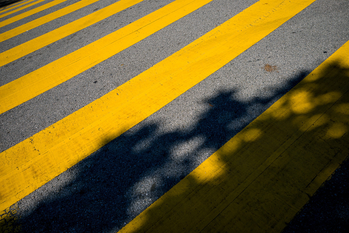
M240 with 24mm Elmar
Under less-than-ideal scenarios in artificial or low light, the M240 wins hands-down. It handles mixed light sources better, although its AWB seems to be slightly on the warm side under most scenarios. A WB Adjust feature on the camera could easily solve this tendency. Shadow noise is well-controlled at higher ISO settings, as is overall image tonality. In post processing, the M240 files can withstand much more modification without breaking down. They have more highlight and shadow recoverability and more malleability overall. This test, at the very least, demonstrated the relative ease in which the M240 files could be made to mimic M9 images. This isn’t to say that you have to make M240 images into M9 ones, just that you can, if this is the look you prefer. What exactly did I have to do to the M240 to make them look like M9 ones? Much of the variance between the two files relates to the openness/lightness of the M240 images. Drop the overall exposure about a stop, pull the blacks down while opening shadows a bit, bump the whites while pulling in the highlights and you are getting close. I also noticed that M9 images tended to have warmer highlights with neutral/cool shadows. To achieve this, I warmed up the white balance and counteracted the warm shadows by using the Split Toning tool to cool the shadows off a bit using no more than 7% saturation. The blues on the M9 images also have a certain deeply saturated look. To hit these tones, I used the HSL tool to increase saturation, drop luminosity and very slightly push the hue towards cyan on the blue channel. There is nothing wrong with the more pure blues of the M240, but to emulate the Kodachrome-like blues of the M9 takes mere seconds, if that's your speed. For images with deep reds and purples, a little hue modification on the red, purple and magenta channels did the trick, but such changes are only necessary if you are really trying to get a close match. Doing so isn’t needed to fix any deficiency. To put it simply, I feel that the biggest differences in the two files could be erased with more shadow contrast, running the exposure darker and applying a slightly different white balance. I ended up making a preset that worked on most files, with only minor tweaking required past that. I also needed to adjust the white balance to match as both cameras were shot with AWB. Personally, I find that merely adjusting WB by eye, rather than using the eyedropper is more effective. Again, the most accurate result isn’t always the most pleasing one.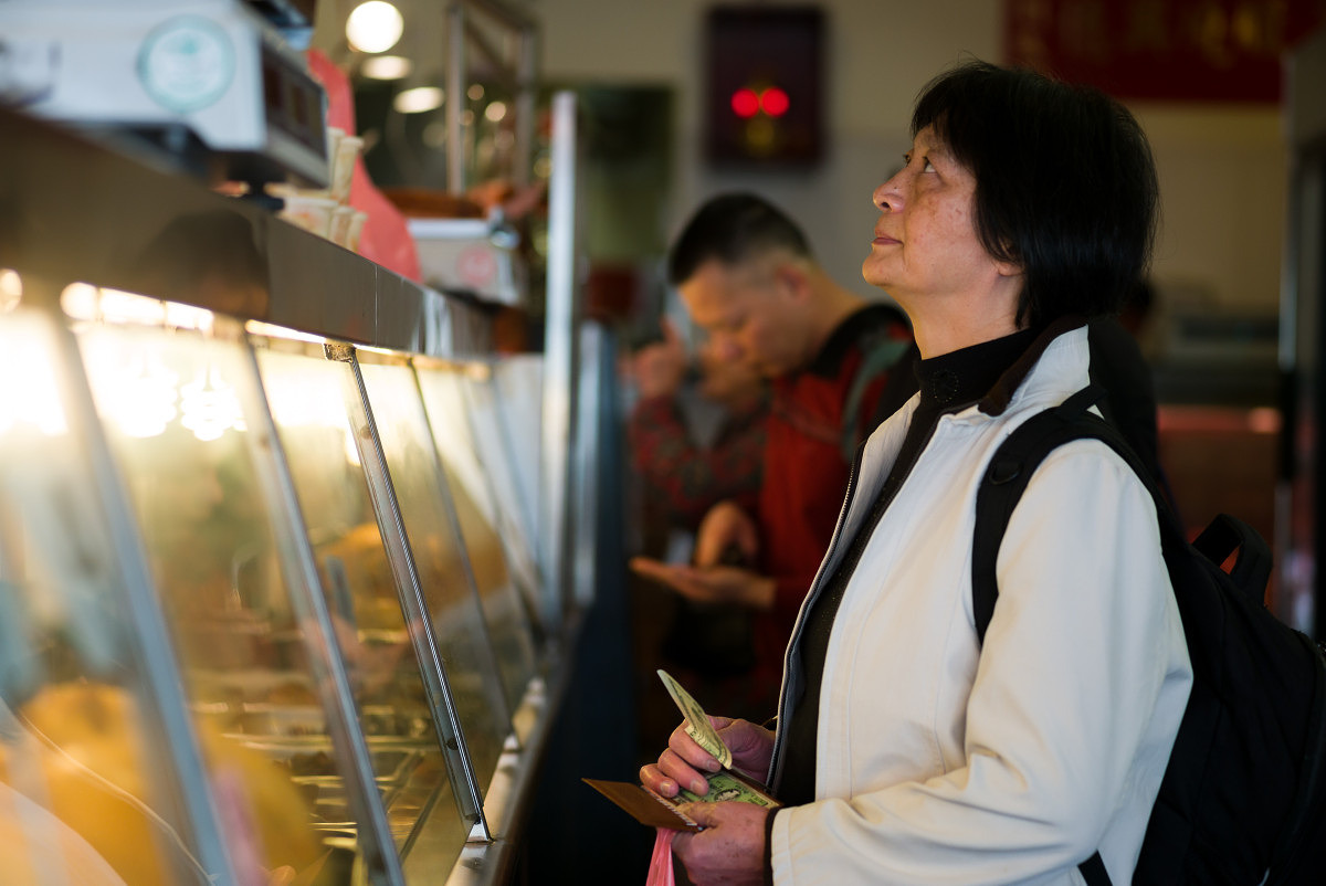
Mixed light sources and blown highlights on M240

M240 file as it opens in Lightroom with no user corrections
Why did I post the images in sRGB? There were some concerns that I used sRGB to display the image comparisons. The reality is that almost all people participating in this test used either a MacBook Pro or iMac with Retina screen. These screens are calibrated to provide 99% sRGB with some level of accuracy. Yes, I’m sure some viewers are using NEC Spectraview and Eizo monitors with AdobeRGB (1998) color gamut, but these would be the exception, not the rule. Posting the images in AdobeRGB (1998) might have caused color inaccuracies for most users and resulted in very little additional color information. Most printing is severely gamut limited as well, with CMYK offset printing offering far less than sRGB. Photographic printing techniques using laser or LED illumination are closer to sRGB, but still shy of this gamut. Some inkjet printer/paper combinations offer a gamut closer to AdobeRGB (1998) but again, this is isn’t necessarily how most are viewing or displaying work. My working space wasn’t sRGB, which definitely would have restricted the available colors from the files. Rather, the output space was sRGB while the working space within Adobe Lightroom was ProPhoto RGB. Remember the original hypothesis being tested was to see whether there was a clearly identifiable difference between the images produced by the CCD-based M9 and the CMOS-based M240. If the “CCD-ness” is so obvious, being displayed in sRGB would hardly affect the outcome.
M240 image with preset applied, WB adjusted, exposure pulled down and blue channel tweaked
Final Thoughts For me, and I imagine for many others who couldn’t tell a definitive difference between either the head-to-head match-ups in Part 1 or the individual shots in Part 2, the results of the experiment are fairly clear. To restate: the hypothesis being tested was to see if the CCD look is real, unmistakable and couldn’t be emulated in post processing. To this end, I think I have at least demonstrated that with just a small amount of global adjustments in Lightroom, M240 files could make for some convincing M9 shots. And while I will give credit to the M9 for the great images it is capable of capturing, the M240 is still a better overall system. I would advise against forsaking the usability and image quality benefits of the newer generation CMOS-based camera based on the conviction that the CCD-based M9 offers superior color rendering. As I already mentioned above, the M9 can turn out gorgeous images. This was never up for debate. In fact, for those that absolutely, positively, just adore the look of CCD, and hold the results of this test as even greater evidence of its superiority, then there is good news. Used M9s can be had for around $3,000 and Leica still offers a CCD-based camera brand new, the Leica M-E for $4,995. But, I do believe that much of the public perceived shortcomings of the M240 look come from its inherent higher dynamic range, the resulting flatter default files, and some users not taking full advantage of both the malleability of the M240 DNG files and the flexibility afforded them in Lightroom. We live in a wonderful time for photography. Our tools in the field and in the digital darkroom are better and more elastic than they've ever been. As photographers, our vision is only limited by our own creativity. Perhaps it's time to put the CCD vs. CMOS debate to rest and just go out and shoot. Thanks again to everyone who participated in this little experiment. View
M9 or M240? Exactly.
The M8 and the M9 have similar looks, but not the same. Some find that the M8 actually has slightly more per-pixel acuity, but the M9 also offered 80% more pixels so overall detail is superior with the M9. The M9 also has better noise performance and slightly more dynamic range than the M8.
-
David Farkas commented on the post, Komaru Titanium Soft Releases Now Available at Leica Store Miami 10 years, 7 months ago
In reply to: Josh Lehrer wrote a new post, Komaru Titanium Soft Releases Now Available at Leica Store Miami Leica Store Miami is now carrying Komaru Titanium Soft Releases, in both the raw and matte finishes, which are designed to fit all Leica M film and digital cameras including the M and M-P (Typ 240). Komaru ('little circle' in Japanese) is a 15mm titanium soft release button with an innovative dual contour design that incorporates both a concave and convex component. Each Komaru is individually machined, partly by hand, in an aeronautical-grade engineering workshop in Toulouse (France) from pure titanium. Komaru offers better thread locking, due to the unique hardness of titanium TA6V. The thread cannot be misthreaded and can be screwed in tightly. This reduces the risk of unscrewing through vibration (leading to loss of the soft release). What's more, Komaru's short conical thread is compatible with all bodies, old or new, such as the latest Leica M models. These soft releases are an excellent way to add a bit of flair to your M camera in addition to enhancing the ergonomics of the shutter release button. Not to mention they are almost weightless thanks to their titanium construction! Komaru soft releases are available online at Leica Store Miami in two different finishes: raw or matte.View
The raw version is the shinier silver one. The price is $59.
-
-
David Farkas wrote a new post, Update on Leica M Monochrom (Typ 246) DNG Files and Mac OS X Yosemite Photos App 10 years, 7 months ago
Here's a little better news for Mac OS X Yosemite users who want to process their Leica M Monochrom (Typ 246) DNG files in either Apple's new Photos app or in their existing Aperture library. Apparently, even […]
-
David Farkas commented on the post, Leica Monochrom (Typ 246) DNG Files Currently Incompatible with Apple ‘Photos’ App 10 years, 7 months ago
In reply to: Josh Lehrer wrote a new post, Leica Monochrom (Typ 246) DNG Files Currently Incompatible with Apple ‘Photos’ App Today, Leica Camera has issued a notice regarding a compatibility issue with DNG files from new Monochrom (Typ 246) and Apple's Photos App. From Leica: Leica Camera would like to inform you that the Leica […] ViewThanks, Mike.
-
David Farkas commented on the post, Leica Monochrom (Typ 246) DNG Files Currently Incompatible with Apple ‘Photos’ App 10 years, 7 months ago
In reply to: Josh Lehrer wrote a new post, Leica Monochrom (Typ 246) DNG Files Currently Incompatible with Apple ‘Photos’ App Today, Leica Camera has issued a notice regarding a compatibility issue with DNG files from new Monochrom (Typ 246) and Apple's Photos App. From Leica: Leica Camera would like to inform you that the Leica […] ViewOS X Yosemite definitely has the issue. Older version probably have it as well, but this hasn't been confirmed to my knowledge.
While there are certainly other programs that can open Leica DNG files, I've found the best results from Adobe Lightroom. Leica has been working closely with Adobe since 2008 and all Leica cameras come bundled with Lightroom.
-
David Farkas commented on the post, The Great Debate: CCD vs. CMOS – Part 3 10 years, 7 months ago
In reply to: David Farkas wrote a new post, The Great Debate: CCD vs. CMOS - Part 3 The results are in! Thanks so much to everyone who cast their votes in both Part 1 and Part 2 of this experiment. The Experiment To recap, I was testing the theory that images from a Leica CCD-based camera have a unique and instantly identifiable look and feel to the images. Many who hold this belief feel that this look cannot be achieved with a CMOS-based camera, regardless of post-processing efforts. To conduct the test, I ventured out with both an M9 and an M240 while I was visiting San Francisco with my family for a couple of days at the end of February. After taking an image with one camera, I’d quickly swap lenses to shoot roughly the same picture with the other body using the same lens and equivalent settings. Part 1: Head-to-Head Comparisons For Part 1, I first processed the M9 files to look like what I’d expect M9 images to look like using my preset and personal preference. I then used the M9 images as a reference to adjust the corresponding M240 files and tried to achieve a rough match. Rather than use all the tools at my disposal to create an exact match, I opted instead to impose some limits. In the spirit of the experiment, I wanted to see if a match could be achieved without using any localized adjustments. No masking. No selections. No adjustment or gradient brushes. Instead, I used only overall image slider adjustments in Adobe Lightroom. After all, this test was not about how good my post processing skills are when given any and all tools and unlimited time. I wanted it to be realistic so that almost anyone with moderate Lightroom skills could produce the same results as I did. The pairs were then posted without metadata and were randomized in the order displayed. Part 1: The Results The results were certainly interesting. On the direct comparisons in Part 1, only 7 out of 19 (36%) match-ups were correctly identified. This is pretty telling. I received feedback from some users that they started taking the test and just gave up halfway through as they couldn’t see any significant differences and felt they were merely guessing. This is visible in the voting numbers, with almost 800 votes for the first set and about 450 for the last set (as of this writing). There were some surprises for me, though. I was amazed that so many were able to accurately identify the M9 images in the Streetcar and Apartment sets. Roughly two thirds of the voters picked correctly on these. On the flip side, I was equally stunned that so many guessed incorrectly on two images which I felt were bound to be easier to pick due to their color ranges: Red Cards and Lombard Street. Most other pairs of images came in very close to 50/50. Keep in mind that this test wasn’t to determine which camera was more capable. It was to merely test the “CCD look” theory. The conditions purposely favored the M9, as the comparisons featured images taken in good quality, directional natural light with vibrant colors, and defined contrast. These kinds of punchy images at low ISO almost always look great from the M9. Here are the raw voting results as of March 6, 2015: Thumbnail Which one was M9? Votes M9 M240 Margin Correct?
Streetcar - 1
796
60.7%
39.3%
21.4%
Yes
Fishing Dock -1
735
56.1%
43.9%
12.2%
Yes
Life Preserver - 1
703
56.3%
43.7%
12.6%
Yes
Fishing Boat Bows - 2
670
47.6%
52.4%
-4.8%
No
Bay Boat Tour - 2
620
46.5%
53.5%
-7.0%
No
Sailboats in front of Alcatraz - 1
563
46.7%
53.3%
-6.6%
No
Magenta Tulips - 1
557
49.2%
50.8%
-1.6%
No
Steps - 2
533
47.5%
52.5%
-5.0%
No
Pier 39 - 1
518
54.2%
45.8%
8.4%
Yes
Church Windows - 2
505
49.9%
50.1%
-0.2%
No
Scarves - 1
489
52.6%
47.4%
5.2%
Yes
Red Cards in Bin - 2
460
43.0%
57.0%
-14.0%
No
Slippers - 2
450
45.8%
54.2%
-8.4%
No
Skyscraper - 1
443
46.5%
53.5%
-7.0%
No
Modern Building - 2
438
47.5%
52.5%
-5.0%
No
Gate - 2
430
48.8%
51.2%
-2.4%
No
Apartments - 1
418
62.7%
37.3%
25.4%
Yes
Walkway with Purple Flowers - 2
437
51.9%
48.1%
3.8%
Yes
Lombard Street - 2
458
42.4%
57.6%
-15.2%
No
Part 2: Single Images
For Part 2, I wanted to take a slightly different approach. I was on vacation and as such, didn’t shoot soley for the sake of making image comparison sets. At a certain point, this kind of shooting gets fairly tedious. Once I knew I had enough material for the test, I just focused on having fun taking pictures like I would normally do in a great shooting locale like San Francisco on a gorgeous day.
For these single images, I processed with respective presets for each camera and my personal taste, picked some of my favorites and posted individual photos. The challenge this time was to correctly identify which camera was used to produce each image. And because, for me, the head-to-head test was over, I allowed myself to seek out a broader range of subjects and more candid scenarios that didn’t only suit the M9. Shots were taken at night, at high ISO, and indoors under artificial lighting. As indicated by the votes on the images, most people erred on the side of picking the M240 for these types of shots. And even with these obvious examples, only 55% of the images were correctly identified. I will say, though, that swings in preferences were much more pronounced than in the head-to-head comparisons of Part 1.
Part 2: The Results I didn’t set out to make this a segment full of trick questions, but unfortunately, I only had two images from the M9 during my free shooting time that I felt were worthwhile to post. Why? Well, frankly, the M240 was more fun to shoot with, so that’s what I used for 90% of my shooting even though I carried both cameras with me. It’s faster. I can use the EVF for precise composition. The LCD screen allows more accurate review. And, ironically, the CMOS sensor fares far better in poor and mixed light and is vastly superior for high ISO shooting. So, if you voted/guessed that every image was taken with the M240 you’d have scored way, way above the average. Here are the raw voting results, again from March 6, 2015: Votes M9 M240 Margin Correct? Which Camera? Cigar Store Café 314 41.4% 58.6% 17.2% Y M240 Washington Square Park 300 62.3% 37.7% -24.6% N M240 Julie on Cable Car 303 30.7% 69.3% 38.6% Y M240 Yellow Tulips 280 45.0% 55.0% 10.0% N M240 Two Guys at the Pier 281 62.6% 37.4% 25.2% Y M9 Red and White Fleet Sign 272 45.6% 54.4% -8.8% N M9 Red Light Gauges 258 33.7% 66.3% 32.6% Y M240 Old Dial pn Sub 261 41.8% 58.2% 16.4% Y M240 Sub Engine Gauges 256 55.9% 44.1% -11.8% N M240 Battle Telephone 243 46.5% 53.5% 7.0% Y M240 SS-383 Conning Tower 251 58.2% 41.8% -16.4% N M240 Leaving Museum 243 62.6% 37.4% -25.2% N M240 Pier at Sunset 253 35.6% 64.4% 28.8% Y M240 Ghiradelli Square at Night 246 48.4% 51.6% 3.2% Y M240 Sunset on the Beach 239 56.9% 43.1% -13.8% N M240 Sophia with Hat 245 37.6% 62.4% 24.8% Y M240 Angled Street 228 45.2% 54.8% 9.6% Y M240 City View out of Round Window 221 62.4% 37.6% -24.8% N M240 Coit Tower Windows 224 57.6% 42.4% -15.2% N M240 Coit Tower Looking Up 223 40.8% 59.2% 18.4% Y M240 Red Car 227 51.1% 48.9% -2.2% N M240 Modern House on Lombard 222 60.8% 39.2% -21.6% N M240 Loading Bay 218 44.0% 56.0% 12.0% Y M240 Parking 217 42.4% 57.6% 15.2% Y M240 Hallway 199 43.7% 56.3% 12.6% Y M240 Fishmonger 206 50.5% 49.5% -1.0% N M240 Drydock 203 40.9% 59.1% 18.2% Y M240 The Embarcadero 200 55.5% 44.5% -11.0% N M240 Roll Your Own 207 59.9% 40.1% -19.8% N M240 Red Door 205 47.3% 52.7% 5.4% Y M240 Shadow Tree 217 56.7% 43.3% -13.4% N M240 Admittedly, many of the M240 images do indeed look like they were taken with the M9. This wasn’t because I was trying to play games or fool anyone. The files ended up this way because I liked the way they looked. Remember, on these images I didn’t have a known aim point. Processing, for me, as I imagine for many other photographers, is highly personal and subjective. Very, very few areas of photography benefit from “accurate” color or tone. Almost all disciplines of our fair art form take liberties to represent our own unique visions. Even before digital, we used filters to alter color or contrast, shot various film types with no two emulsions offering the same visual fingerprint, employed different chemistry to achieve a specific look, and messed around in the darkroom for hours to create our desired finished vision. I make no apologies for editing my images to suit my tastes. And, furthermore, I think that the pursuit of a mythical “accurate” or “neutral” result out of camera with no processing doesn’t jive with the most basic tenets of photography, be it film or digital. This quixotic quest, while appearing reasonable and noble, doesn’t make better photographs. But I digress.M240 with 24mm Elmar
Looking at the results from Part 2, images like Washington Square Park, Roll Your Own, Modern House on Lombard and City View Out of Round Window fooled around two thirds of voters. Other images that are well-suited to the M240, like Julie on Cable Car, which was taken at ISO 1000 shooting into a heavily-backlit scene seemed a bit more obvious with almost 70% picking that one accurately. From my experience, an M9 would not have been so graceful here. Likewise, most people picked the M240 for the submarine interior shots, which were handheld at ISO 1600, except for Red Light Gauges, which was taken at ISO 2500. Shots where I left the files more open and airy, rather than pulling down the darker midtones like Coit Tower Looking Up, were also correctly identified as M240. The reality is that I am quite fond of images that I’ve taken with both the M9 and the M240. I never really took to direct comparisons as I wasn’t displeased with the different look offered by the M240. In my particular workflow, I apply my own homegrown import presets based on camera model when I bring my DNG files into Lightroom. I have presets for S, M9, M240, M Monochrom, X Vario, T and D-Lux. If you don’t already use presets, I urge you to incorporate these into your own workflow. By applying baseline corrections and settings that you’d use anyway, you’ll save considerable time when processing a large number of files. And, perhaps more important to me, is that I am able to get a better idea of an image’s worth as the untouched files already have a look that I like and expect. This makes selection and editing a more streamlined process.M240 with 35mm Summilux
No such thing as out of camera In spite of what you may have heard, there is no such thing as “out-of-camera.” It doesn’t exist. A sensor is a collection of monochrome pixels. The Bayer filter, or color filter array (CFA), over the sensor allows the camera to see color. But, only 1/3 of the color information is actually being captured. The rest is interpolated. This process of interpolation is called demosaicing, whereby a coherent full-color image is generated from the individually colored pixels. The software opening the RAW file performs the interpolation and renders colors based on input profiles and the type of algorithm used, along with any “secret sauce” the software might put in. For Leica M files, Lightroom has two different built-in profiles (Embedded and Adobe Standard), or you can make your own. You can also change the rendering process version (2012, 2010, 2003) and see different results. So much is done to manipulate the file before you ever open it in Lightroom or ACR or Capture One or Aperture. Pretending that what the program shows you by default is somehow virginal or unmolested is the stuff of fantasy. Does it benefit the photographer when the default image shown in Lightroom is close to the look they want without much editing? Of course, and this is a testament to the program’s algorithms and camera profile. But, it isn’t everything. Users can make their own camera profiles and their own presets to change the default “out-of-camera” behavior. Personally, I don’t take much stock in tests talking about or showing out-of-camera results with no post processing of any kind (although there is always much processing performed before this by the software), just as I never took to judging negatives off the processing line, without first making prints with my own set of corrections. Lessons Learned I learned quite a lot about both the M9 and M240 during this test. I was pleasantly surprised to rediscover the M9. The camera can indeed produce some really stunning images under the right conditions. To its credit and, in line with what CCD supporters say, the color palette produced by default in Lightroom (after my preset application) is extremely pleasing in most cases. Images have a bite and saturation that is very attractive. Deep blues, thick midtones and punchy highlights add to the M9’s inherent per-pixel sharpness. In daylight shooting with good, directional light and a scene with saturated colors, the M9 is truly hard to beat. Even though the camera is going on six years old, it still produces images that keep pace with the best. Its weakness, due to its CCD sensor, is low light performance. If your shooting needs don’t dictate the need for ISO 3200 and you've got some fast M glass to boot, well, by all means, the M9 can still work its magic for you. The M240, for its part, puts out smoother, more nuanced files that hold more dynamic range, a gentler highlight roll-off and cleaner shadow information. Blowing highlights on the M240 can be done without ruining the entire image as there is a certain glow and transition, rather than a clipped, sharp edge look as in the M9. Shooting strongly backlit subjects or even directly into bright light sources is a fun and fruitful experience, not a painful one, especially when paired with highly flare-resistant lenses like the 35mm f/1.4 Summilux-M ASPH FLE.M240 with 24mm Elmar
Under less-than-ideal scenarios in artificial or low light, the M240 wins hands-down. It handles mixed light sources better, although its AWB seems to be slightly on the warm side under most scenarios. A WB Adjust feature on the camera could easily solve this tendency. Shadow noise is well-controlled at higher ISO settings, as is overall image tonality. In post processing, the M240 files can withstand much more modification without breaking down. They have more highlight and shadow recoverability and more malleability overall. This test, at the very least, demonstrated the relative ease in which the M240 files could be made to mimic M9 images. This isn’t to say that you have to make M240 images into M9 ones, just that you can, if this is the look you prefer. What exactly did I have to do to the M240 to make them look like M9 ones? Much of the variance between the two files relates to the openness/lightness of the M240 images. Drop the overall exposure about a stop, pull the blacks down while opening shadows a bit, bump the whites while pulling in the highlights and you are getting close. I also noticed that M9 images tended to have warmer highlights with neutral/cool shadows. To achieve this, I warmed up the white balance and counteracted the warm shadows by using the Split Toning tool to cool the shadows off a bit using no more than 7% saturation. The blues on the M9 images also have a certain deeply saturated look. To hit these tones, I used the HSL tool to increase saturation, drop luminosity and very slightly push the hue towards cyan on the blue channel. There is nothing wrong with the more pure blues of the M240, but to emulate the Kodachrome-like blues of the M9 takes mere seconds, if that's your speed. For images with deep reds and purples, a little hue modification on the red, purple and magenta channels did the trick, but such changes are only necessary if you are really trying to get a close match. Doing so isn’t needed to fix any deficiency. To put it simply, I feel that the biggest differences in the two files could be erased with more shadow contrast, running the exposure darker and applying a slightly different white balance. I ended up making a preset that worked on most files, with only minor tweaking required past that. I also needed to adjust the white balance to match as both cameras were shot with AWB. Personally, I find that merely adjusting WB by eye, rather than using the eyedropper is more effective. Again, the most accurate result isn’t always the most pleasing one.Mixed light sources and blown highlights on M240
M240 file as it opens in Lightroom with no user corrections
Why did I post the images in sRGB? There were some concerns that I used sRGB to display the image comparisons. The reality is that almost all people participating in this test used either a MacBook Pro or iMac with Retina screen. These screens are calibrated to provide 99% sRGB with some level of accuracy. Yes, I’m sure some viewers are using NEC Spectraview and Eizo monitors with AdobeRGB (1998) color gamut, but these would be the exception, not the rule. Posting the images in AdobeRGB (1998) might have caused color inaccuracies for most users and resulted in very little additional color information. Most printing is severely gamut limited as well, with CMYK offset printing offering far less than sRGB. Photographic printing techniques using laser or LED illumination are closer to sRGB, but still shy of this gamut. Some inkjet printer/paper combinations offer a gamut closer to AdobeRGB (1998) but again, this is isn’t necessarily how most are viewing or displaying work. My working space wasn’t sRGB, which definitely would have restricted the available colors from the files. Rather, the output space was sRGB while the working space within Adobe Lightroom was ProPhoto RGB. Remember the original hypothesis being tested was to see whether there was a clearly identifiable difference between the images produced by the CCD-based M9 and the CMOS-based M240. If the “CCD-ness” is so obvious, being displayed in sRGB would hardly affect the outcome.M240 image with preset applied, WB adjusted, exposure pulled down and blue channel tweaked
Final Thoughts For me, and I imagine for many others who couldn’t tell a definitive difference between either the head-to-head match-ups in Part 1 or the individual shots in Part 2, the results of the experiment are fairly clear. To restate: the hypothesis being tested was to see if the CCD look is real, unmistakable and couldn’t be emulated in post processing. To this end, I think I have at least demonstrated that with just a small amount of global adjustments in Lightroom, M240 files could make for some convincing M9 shots. And while I will give credit to the M9 for the great images it is capable of capturing, the M240 is still a better overall system. I would advise against forsaking the usability and image quality benefits of the newer generation CMOS-based camera based on the conviction that the CCD-based M9 offers superior color rendering. As I already mentioned above, the M9 can turn out gorgeous images. This was never up for debate. In fact, for those that absolutely, positively, just adore the look of CCD, and hold the results of this test as even greater evidence of its superiority, then there is good news. Used M9s can be had for around $3,000 and Leica still offers a CCD-based camera brand new, the Leica M-E for $4,995. But, I do believe that much of the public perceived shortcomings of the M240 look come from its inherent higher dynamic range, the resulting flatter default files, and some users not taking full advantage of both the malleability of the M240 DNG files and the flexibility afforded them in Lightroom. We live in a wonderful time for photography. Our tools in the field and in the digital darkroom are better and more elastic than they've ever been. As photographers, our vision is only limited by our own creativity. Perhaps it's time to put the CCD vs. CMOS debate to rest and just go out and shoot. Thanks again to everyone who participated in this little experiment. ViewM9 or M240? Exactly.
The point isn't to say that there is anything wrong with the look of the M240 files. I like M240 files. I was attempting to demonstrate that perhaps the “CCD look” that some users love can be replicated in post processing from a CMOS sensor. In my mind, one is not necessarily better than the other. If you like the default rendering of the M240,…[Read more]
-
David Farkas commented on the post, Leica M Monochrom (Typ 246) Review 10 years, 7 months ago
In reply to: David Farkas wrote a new post, Leica M Monochrom (Typ 246) Review Many in the photographic community have speculated that it was only a matter of time until Leica made a monochrome version of the M (Typ 240), more commonly known as the M240. The original M Monochrom, perhaps now […] View
Sure. Here is a screen grab from my basic settings in LR for an M246 file:
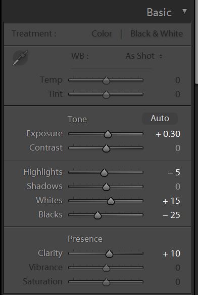
My biggest change is to pull down the blacks and bring up the exposure to compensate a little. I like rich shadow contrast. Really, though, these changes are fairly minor. Sometimes, I'll bring up the shadows or tone down the highlights more. It really depends on the…[Read more]
-
David Farkas commented on the post, Leica M Monochrom (Typ 246) Review 10 years, 7 months ago
In reply to: David Farkas wrote a new post, Leica M Monochrom (Typ 246) Review Many in the photographic community have speculated that it was only a matter of time until Leica made a monochrome version of the M (Typ 240), more commonly known as the M240. The original M Monochrom, perhaps now […] View
All of the images were processed in Adobe Lightroom CC (v6).
-
David Farkas commented on the post, The Great Debate: CCD vs. CMOS – Part 3 10 years, 7 months ago
In reply to: David Farkas wrote a new post, The Great Debate: CCD vs. CMOS - Part 3 The results are in! Thanks so much to everyone who cast their votes in both Part 1 and Part 2 of this experiment. The Experiment To recap, I was testing the theory that images from a Leica CCD-based camera have a unique and instantly identifiable look and feel to the images. Many who hold this belief feel that this look cannot be achieved with a CMOS-based camera, regardless of post-processing efforts. To conduct the test, I ventured out with both an M9 and an M240 while I was visiting San Francisco with my family for a couple of days at the end of February. After taking an image with one camera, I’d quickly swap lenses to shoot roughly the same picture with the other body using the same lens and equivalent settings. Part 1: Head-to-Head Comparisons For Part 1, I first processed the M9 files to look like what I’d expect M9 images to look like using my preset and personal preference. I then used the M9 images as a reference to adjust the corresponding M240 files and tried to achieve a rough match. Rather than use all the tools at my disposal to create an exact match, I opted instead to impose some limits. In the spirit of the experiment, I wanted to see if a match could be achieved without using any localized adjustments. No masking. No selections. No adjustment or gradient brushes. Instead, I used only overall image slider adjustments in Adobe Lightroom. After all, this test was not about how good my post processing skills are when given any and all tools and unlimited time. I wanted it to be realistic so that almost anyone with moderate Lightroom skills could produce the same results as I did. The pairs were then posted without metadata and were randomized in the order displayed. Part 1: The Results The results were certainly interesting. On the direct comparisons in Part 1, only 7 out of 19 (36%) match-ups were correctly identified. This is pretty telling. I received feedback from some users that they started taking the test and just gave up halfway through as they couldn’t see any significant differences and felt they were merely guessing. This is visible in the voting numbers, with almost 800 votes for the first set and about 450 for the last set (as of this writing). There were some surprises for me, though. I was amazed that so many were able to accurately identify the M9 images in the Streetcar and Apartment sets. Roughly two thirds of the voters picked correctly on these. On the flip side, I was equally stunned that so many guessed incorrectly on two images which I felt were bound to be easier to pick due to their color ranges: Red Cards and Lombard Street. Most other pairs of images came in very close to 50/50. Keep in mind that this test wasn’t to determine which camera was more capable. It was to merely test the “CCD look” theory. The conditions purposely favored the M9, as the comparisons featured images taken in good quality, directional natural light with vibrant colors, and defined contrast. These kinds of punchy images at low ISO almost always look great from the M9. Here are the raw voting results as of March 6, 2015: Thumbnail Which one was M9? Votes M9 M240 Margin Correct?
Streetcar - 1
796
60.7%
39.3%
21.4%
Yes
Fishing Dock -1
735
56.1%
43.9%
12.2%
Yes
Life Preserver - 1
703
56.3%
43.7%
12.6%
Yes
Fishing Boat Bows - 2
670
47.6%
52.4%
-4.8%
No
Bay Boat Tour - 2
620
46.5%
53.5%
-7.0%
No
Sailboats in front of Alcatraz - 1
563
46.7%
53.3%
-6.6%
No
Magenta Tulips - 1
557
49.2%
50.8%
-1.6%
No
Steps - 2
533
47.5%
52.5%
-5.0%
No
Pier 39 - 1
518
54.2%
45.8%
8.4%
Yes
Church Windows - 2
505
49.9%
50.1%
-0.2%
No
Scarves - 1
489
52.6%
47.4%
5.2%
Yes
Red Cards in Bin - 2
460
43.0%
57.0%
-14.0%
No
Slippers - 2
450
45.8%
54.2%
-8.4%
No
Skyscraper - 1
443
46.5%
53.5%
-7.0%
No
Modern Building - 2
438
47.5%
52.5%
-5.0%
No
Gate - 2
430
48.8%
51.2%
-2.4%
No
Apartments - 1
418
62.7%
37.3%
25.4%
Yes
Walkway with Purple Flowers - 2
437
51.9%
48.1%
3.8%
Yes
Lombard Street - 2
458
42.4%
57.6%
-15.2%
No
Part 2: Single Images
For Part 2, I wanted to take a slightly different approach. I was on vacation and as such, didn’t shoot soley for the sake of making image comparison sets. At a certain point, this kind of shooting gets fairly tedious. Once I knew I had enough material for the test, I just focused on having fun taking pictures like I would normally do in a great shooting locale like San Francisco on a gorgeous day.
For these single images, I processed with respective presets for each camera and my personal taste, picked some of my favorites and posted individual photos. The challenge this time was to correctly identify which camera was used to produce each image. And because, for me, the head-to-head test was over, I allowed myself to seek out a broader range of subjects and more candid scenarios that didn’t only suit the M9. Shots were taken at night, at high ISO, and indoors under artificial lighting. As indicated by the votes on the images, most people erred on the side of picking the M240 for these types of shots. And even with these obvious examples, only 55% of the images were correctly identified. I will say, though, that swings in preferences were much more pronounced than in the head-to-head comparisons of Part 1.
Part 2: The Results I didn’t set out to make this a segment full of trick questions, but unfortunately, I only had two images from the M9 during my free shooting time that I felt were worthwhile to post. Why? Well, frankly, the M240 was more fun to shoot with, so that’s what I used for 90% of my shooting even though I carried both cameras with me. It’s faster. I can use the EVF for precise composition. The LCD screen allows more accurate review. And, ironically, the CMOS sensor fares far better in poor and mixed light and is vastly superior for high ISO shooting. So, if you voted/guessed that every image was taken with the M240 you’d have scored way, way above the average. Here are the raw voting results, again from March 6, 2015: Votes M9 M240 Margin Correct? Which Camera? Cigar Store Café 314 41.4% 58.6% 17.2% Y M240 Washington Square Park 300 62.3% 37.7% -24.6% N M240 Julie on Cable Car 303 30.7% 69.3% 38.6% Y M240 Yellow Tulips 280 45.0% 55.0% 10.0% N M240 Two Guys at the Pier 281 62.6% 37.4% 25.2% Y M9 Red and White Fleet Sign 272 45.6% 54.4% -8.8% N M9 Red Light Gauges 258 33.7% 66.3% 32.6% Y M240 Old Dial pn Sub 261 41.8% 58.2% 16.4% Y M240 Sub Engine Gauges 256 55.9% 44.1% -11.8% N M240 Battle Telephone 243 46.5% 53.5% 7.0% Y M240 SS-383 Conning Tower 251 58.2% 41.8% -16.4% N M240 Leaving Museum 243 62.6% 37.4% -25.2% N M240 Pier at Sunset 253 35.6% 64.4% 28.8% Y M240 Ghiradelli Square at Night 246 48.4% 51.6% 3.2% Y M240 Sunset on the Beach 239 56.9% 43.1% -13.8% N M240 Sophia with Hat 245 37.6% 62.4% 24.8% Y M240 Angled Street 228 45.2% 54.8% 9.6% Y M240 City View out of Round Window 221 62.4% 37.6% -24.8% N M240 Coit Tower Windows 224 57.6% 42.4% -15.2% N M240 Coit Tower Looking Up 223 40.8% 59.2% 18.4% Y M240 Red Car 227 51.1% 48.9% -2.2% N M240 Modern House on Lombard 222 60.8% 39.2% -21.6% N M240 Loading Bay 218 44.0% 56.0% 12.0% Y M240 Parking 217 42.4% 57.6% 15.2% Y M240 Hallway 199 43.7% 56.3% 12.6% Y M240 Fishmonger 206 50.5% 49.5% -1.0% N M240 Drydock 203 40.9% 59.1% 18.2% Y M240 The Embarcadero 200 55.5% 44.5% -11.0% N M240 Roll Your Own 207 59.9% 40.1% -19.8% N M240 Red Door 205 47.3% 52.7% 5.4% Y M240 Shadow Tree 217 56.7% 43.3% -13.4% N M240 Admittedly, many of the M240 images do indeed look like they were taken with the M9. This wasn’t because I was trying to play games or fool anyone. The files ended up this way because I liked the way they looked. Remember, on these images I didn’t have a known aim point. Processing, for me, as I imagine for many other photographers, is highly personal and subjective. Very, very few areas of photography benefit from “accurate” color or tone. Almost all disciplines of our fair art form take liberties to represent our own unique visions. Even before digital, we used filters to alter color or contrast, shot various film types with no two emulsions offering the same visual fingerprint, employed different chemistry to achieve a specific look, and messed around in the darkroom for hours to create our desired finished vision. I make no apologies for editing my images to suit my tastes. And, furthermore, I think that the pursuit of a mythical “accurate” or “neutral” result out of camera with no processing doesn’t jive with the most basic tenets of photography, be it film or digital. This quixotic quest, while appearing reasonable and noble, doesn’t make better photographs. But I digress.M240 with 24mm Elmar
Looking at the results from Part 2, images like Washington Square Park, Roll Your Own, Modern House on Lombard and City View Out of Round Window fooled around two thirds of voters. Other images that are well-suited to the M240, like Julie on Cable Car, which was taken at ISO 1000 shooting into a heavily-backlit scene seemed a bit more obvious with almost 70% picking that one accurately. From my experience, an M9 would not have been so graceful here. Likewise, most people picked the M240 for the submarine interior shots, which were handheld at ISO 1600, except for Red Light Gauges, which was taken at ISO 2500. Shots where I left the files more open and airy, rather than pulling down the darker midtones like Coit Tower Looking Up, were also correctly identified as M240. The reality is that I am quite fond of images that I’ve taken with both the M9 and the M240. I never really took to direct comparisons as I wasn’t displeased with the different look offered by the M240. In my particular workflow, I apply my own homegrown import presets based on camera model when I bring my DNG files into Lightroom. I have presets for S, M9, M240, M Monochrom, X Vario, T and D-Lux. If you don’t already use presets, I urge you to incorporate these into your own workflow. By applying baseline corrections and settings that you’d use anyway, you’ll save considerable time when processing a large number of files. And, perhaps more important to me, is that I am able to get a better idea of an image’s worth as the untouched files already have a look that I like and expect. This makes selection and editing a more streamlined process.M240 with 35mm Summilux
No such thing as out of camera In spite of what you may have heard, there is no such thing as “out-of-camera.” It doesn’t exist. A sensor is a collection of monochrome pixels. The Bayer filter, or color filter array (CFA), over the sensor allows the camera to see color. But, only 1/3 of the color information is actually being captured. The rest is interpolated. This process of interpolation is called demosaicing, whereby a coherent full-color image is generated from the individually colored pixels. The software opening the RAW file performs the interpolation and renders colors based on input profiles and the type of algorithm used, along with any “secret sauce” the software might put in. For Leica M files, Lightroom has two different built-in profiles (Embedded and Adobe Standard), or you can make your own. You can also change the rendering process version (2012, 2010, 2003) and see different results. So much is done to manipulate the file before you ever open it in Lightroom or ACR or Capture One or Aperture. Pretending that what the program shows you by default is somehow virginal or unmolested is the stuff of fantasy. Does it benefit the photographer when the default image shown in Lightroom is close to the look they want without much editing? Of course, and this is a testament to the program’s algorithms and camera profile. But, it isn’t everything. Users can make their own camera profiles and their own presets to change the default “out-of-camera” behavior. Personally, I don’t take much stock in tests talking about or showing out-of-camera results with no post processing of any kind (although there is always much processing performed before this by the software), just as I never took to judging negatives off the processing line, without first making prints with my own set of corrections. Lessons Learned I learned quite a lot about both the M9 and M240 during this test. I was pleasantly surprised to rediscover the M9. The camera can indeed produce some really stunning images under the right conditions. To its credit and, in line with what CCD supporters say, the color palette produced by default in Lightroom (after my preset application) is extremely pleasing in most cases. Images have a bite and saturation that is very attractive. Deep blues, thick midtones and punchy highlights add to the M9’s inherent per-pixel sharpness. In daylight shooting with good, directional light and a scene with saturated colors, the M9 is truly hard to beat. Even though the camera is going on six years old, it still produces images that keep pace with the best. Its weakness, due to its CCD sensor, is low light performance. If your shooting needs don’t dictate the need for ISO 3200 and you've got some fast M glass to boot, well, by all means, the M9 can still work its magic for you. The M240, for its part, puts out smoother, more nuanced files that hold more dynamic range, a gentler highlight roll-off and cleaner shadow information. Blowing highlights on the M240 can be done without ruining the entire image as there is a certain glow and transition, rather than a clipped, sharp edge look as in the M9. Shooting strongly backlit subjects or even directly into bright light sources is a fun and fruitful experience, not a painful one, especially when paired with highly flare-resistant lenses like the 35mm f/1.4 Summilux-M ASPH FLE.M240 with 24mm Elmar
Under less-than-ideal scenarios in artificial or low light, the M240 wins hands-down. It handles mixed light sources better, although its AWB seems to be slightly on the warm side under most scenarios. A WB Adjust feature on the camera could easily solve this tendency. Shadow noise is well-controlled at higher ISO settings, as is overall image tonality. In post processing, the M240 files can withstand much more modification without breaking down. They have more highlight and shadow recoverability and more malleability overall. This test, at the very least, demonstrated the relative ease in which the M240 files could be made to mimic M9 images. This isn’t to say that you have to make M240 images into M9 ones, just that you can, if this is the look you prefer. What exactly did I have to do to the M240 to make them look like M9 ones? Much of the variance between the two files relates to the openness/lightness of the M240 images. Drop the overall exposure about a stop, pull the blacks down while opening shadows a bit, bump the whites while pulling in the highlights and you are getting close. I also noticed that M9 images tended to have warmer highlights with neutral/cool shadows. To achieve this, I warmed up the white balance and counteracted the warm shadows by using the Split Toning tool to cool the shadows off a bit using no more than 7% saturation. The blues on the M9 images also have a certain deeply saturated look. To hit these tones, I used the HSL tool to increase saturation, drop luminosity and very slightly push the hue towards cyan on the blue channel. There is nothing wrong with the more pure blues of the M240, but to emulate the Kodachrome-like blues of the M9 takes mere seconds, if that's your speed. For images with deep reds and purples, a little hue modification on the red, purple and magenta channels did the trick, but such changes are only necessary if you are really trying to get a close match. Doing so isn’t needed to fix any deficiency. To put it simply, I feel that the biggest differences in the two files could be erased with more shadow contrast, running the exposure darker and applying a slightly different white balance. I ended up making a preset that worked on most files, with only minor tweaking required past that. I also needed to adjust the white balance to match as both cameras were shot with AWB. Personally, I find that merely adjusting WB by eye, rather than using the eyedropper is more effective. Again, the most accurate result isn’t always the most pleasing one.Mixed light sources and blown highlights on M240
M240 file as it opens in Lightroom with no user corrections
Why did I post the images in sRGB? There were some concerns that I used sRGB to display the image comparisons. The reality is that almost all people participating in this test used either a MacBook Pro or iMac with Retina screen. These screens are calibrated to provide 99% sRGB with some level of accuracy. Yes, I’m sure some viewers are using NEC Spectraview and Eizo monitors with AdobeRGB (1998) color gamut, but these would be the exception, not the rule. Posting the images in AdobeRGB (1998) might have caused color inaccuracies for most users and resulted in very little additional color information. Most printing is severely gamut limited as well, with CMYK offset printing offering far less than sRGB. Photographic printing techniques using laser or LED illumination are closer to sRGB, but still shy of this gamut. Some inkjet printer/paper combinations offer a gamut closer to AdobeRGB (1998) but again, this is isn’t necessarily how most are viewing or displaying work. My working space wasn’t sRGB, which definitely would have restricted the available colors from the files. Rather, the output space was sRGB while the working space within Adobe Lightroom was ProPhoto RGB. Remember the original hypothesis being tested was to see whether there was a clearly identifiable difference between the images produced by the CCD-based M9 and the CMOS-based M240. If the “CCD-ness” is so obvious, being displayed in sRGB would hardly affect the outcome.M240 image with preset applied, WB adjusted, exposure pulled down and blue channel tweaked
Final Thoughts For me, and I imagine for many others who couldn’t tell a definitive difference between either the head-to-head match-ups in Part 1 or the individual shots in Part 2, the results of the experiment are fairly clear. To restate: the hypothesis being tested was to see if the CCD look is real, unmistakable and couldn’t be emulated in post processing. To this end, I think I have at least demonstrated that with just a small amount of global adjustments in Lightroom, M240 files could make for some convincing M9 shots. And while I will give credit to the M9 for the great images it is capable of capturing, the M240 is still a better overall system. I would advise against forsaking the usability and image quality benefits of the newer generation CMOS-based camera based on the conviction that the CCD-based M9 offers superior color rendering. As I already mentioned above, the M9 can turn out gorgeous images. This was never up for debate. In fact, for those that absolutely, positively, just adore the look of CCD, and hold the results of this test as even greater evidence of its superiority, then there is good news. Used M9s can be had for around $3,000 and Leica still offers a CCD-based camera brand new, the Leica M-E for $4,995. But, I do believe that much of the public perceived shortcomings of the M240 look come from its inherent higher dynamic range, the resulting flatter default files, and some users not taking full advantage of both the malleability of the M240 DNG files and the flexibility afforded them in Lightroom. We live in a wonderful time for photography. Our tools in the field and in the digital darkroom are better and more elastic than they've ever been. As photographers, our vision is only limited by our own creativity. Perhaps it's time to put the CCD vs. CMOS debate to rest and just go out and shoot. Thanks again to everyone who participated in this little experiment. ViewM9 or M240? Exactly.
No problem. I'll email them over to you.
-
David Farkas commented on the post, The Great Debate: CCD vs. CMOS – Part 3 10 years, 7 months ago
In reply to: David Farkas wrote a new post, The Great Debate: CCD vs. CMOS - Part 3 The results are in! Thanks so much to everyone who cast their votes in both Part 1 and Part 2 of this experiment. The Experiment To recap, I was testing the theory that images from a Leica CCD-based camera have a unique and instantly identifiable look and feel to the images. Many who hold this belief feel that this look cannot be achieved with a CMOS-based camera, regardless of post-processing efforts. To conduct the test, I ventured out with both an M9 and an M240 while I was visiting San Francisco with my family for a couple of days at the end of February. After taking an image with one camera, I’d quickly swap lenses to shoot roughly the same picture with the other body using the same lens and equivalent settings. Part 1: Head-to-Head Comparisons For Part 1, I first processed the M9 files to look like what I’d expect M9 images to look like using my preset and personal preference. I then used the M9 images as a reference to adjust the corresponding M240 files and tried to achieve a rough match. Rather than use all the tools at my disposal to create an exact match, I opted instead to impose some limits. In the spirit of the experiment, I wanted to see if a match could be achieved without using any localized adjustments. No masking. No selections. No adjustment or gradient brushes. Instead, I used only overall image slider adjustments in Adobe Lightroom. After all, this test was not about how good my post processing skills are when given any and all tools and unlimited time. I wanted it to be realistic so that almost anyone with moderate Lightroom skills could produce the same results as I did. The pairs were then posted without metadata and were randomized in the order displayed. Part 1: The Results The results were certainly interesting. On the direct comparisons in Part 1, only 7 out of 19 (36%) match-ups were correctly identified. This is pretty telling. I received feedback from some users that they started taking the test and just gave up halfway through as they couldn’t see any significant differences and felt they were merely guessing. This is visible in the voting numbers, with almost 800 votes for the first set and about 450 for the last set (as of this writing). There were some surprises for me, though. I was amazed that so many were able to accurately identify the M9 images in the Streetcar and Apartment sets. Roughly two thirds of the voters picked correctly on these. On the flip side, I was equally stunned that so many guessed incorrectly on two images which I felt were bound to be easier to pick due to their color ranges: Red Cards and Lombard Street. Most other pairs of images came in very close to 50/50. Keep in mind that this test wasn’t to determine which camera was more capable. It was to merely test the “CCD look” theory. The conditions purposely favored the M9, as the comparisons featured images taken in good quality, directional natural light with vibrant colors, and defined contrast. These kinds of punchy images at low ISO almost always look great from the M9. Here are the raw voting results as of March 6, 2015: Thumbnail Which one was M9? Votes M9 M240 Margin Correct?
Streetcar - 1
796
60.7%
39.3%
21.4%
Yes
Fishing Dock -1
735
56.1%
43.9%
12.2%
Yes
Life Preserver - 1
703
56.3%
43.7%
12.6%
Yes
Fishing Boat Bows - 2
670
47.6%
52.4%
-4.8%
No
Bay Boat Tour - 2
620
46.5%
53.5%
-7.0%
No
Sailboats in front of Alcatraz - 1
563
46.7%
53.3%
-6.6%
No
Magenta Tulips - 1
557
49.2%
50.8%
-1.6%
No
Steps - 2
533
47.5%
52.5%
-5.0%
No
Pier 39 - 1
518
54.2%
45.8%
8.4%
Yes
Church Windows - 2
505
49.9%
50.1%
-0.2%
No
Scarves - 1
489
52.6%
47.4%
5.2%
Yes
Red Cards in Bin - 2
460
43.0%
57.0%
-14.0%
No
Slippers - 2
450
45.8%
54.2%
-8.4%
No
Skyscraper - 1
443
46.5%
53.5%
-7.0%
No
Modern Building - 2
438
47.5%
52.5%
-5.0%
No
Gate - 2
430
48.8%
51.2%
-2.4%
No
Apartments - 1
418
62.7%
37.3%
25.4%
Yes
Walkway with Purple Flowers - 2
437
51.9%
48.1%
3.8%
Yes
Lombard Street - 2
458
42.4%
57.6%
-15.2%
No
Part 2: Single Images
For Part 2, I wanted to take a slightly different approach. I was on vacation and as such, didn’t shoot soley for the sake of making image comparison sets. At a certain point, this kind of shooting gets fairly tedious. Once I knew I had enough material for the test, I just focused on having fun taking pictures like I would normally do in a great shooting locale like San Francisco on a gorgeous day.
For these single images, I processed with respective presets for each camera and my personal taste, picked some of my favorites and posted individual photos. The challenge this time was to correctly identify which camera was used to produce each image. And because, for me, the head-to-head test was over, I allowed myself to seek out a broader range of subjects and more candid scenarios that didn’t only suit the M9. Shots were taken at night, at high ISO, and indoors under artificial lighting. As indicated by the votes on the images, most people erred on the side of picking the M240 for these types of shots. And even with these obvious examples, only 55% of the images were correctly identified. I will say, though, that swings in preferences were much more pronounced than in the head-to-head comparisons of Part 1.
Part 2: The Results I didn’t set out to make this a segment full of trick questions, but unfortunately, I only had two images from the M9 during my free shooting time that I felt were worthwhile to post. Why? Well, frankly, the M240 was more fun to shoot with, so that’s what I used for 90% of my shooting even though I carried both cameras with me. It’s faster. I can use the EVF for precise composition. The LCD screen allows more accurate review. And, ironically, the CMOS sensor fares far better in poor and mixed light and is vastly superior for high ISO shooting. So, if you voted/guessed that every image was taken with the M240 you’d have scored way, way above the average. Here are the raw voting results, again from March 6, 2015: Votes M9 M240 Margin Correct? Which Camera? Cigar Store Café 314 41.4% 58.6% 17.2% Y M240 Washington Square Park 300 62.3% 37.7% -24.6% N M240 Julie on Cable Car 303 30.7% 69.3% 38.6% Y M240 Yellow Tulips 280 45.0% 55.0% 10.0% N M240 Two Guys at the Pier 281 62.6% 37.4% 25.2% Y M9 Red and White Fleet Sign 272 45.6% 54.4% -8.8% N M9 Red Light Gauges 258 33.7% 66.3% 32.6% Y M240 Old Dial pn Sub 261 41.8% 58.2% 16.4% Y M240 Sub Engine Gauges 256 55.9% 44.1% -11.8% N M240 Battle Telephone 243 46.5% 53.5% 7.0% Y M240 SS-383 Conning Tower 251 58.2% 41.8% -16.4% N M240 Leaving Museum 243 62.6% 37.4% -25.2% N M240 Pier at Sunset 253 35.6% 64.4% 28.8% Y M240 Ghiradelli Square at Night 246 48.4% 51.6% 3.2% Y M240 Sunset on the Beach 239 56.9% 43.1% -13.8% N M240 Sophia with Hat 245 37.6% 62.4% 24.8% Y M240 Angled Street 228 45.2% 54.8% 9.6% Y M240 City View out of Round Window 221 62.4% 37.6% -24.8% N M240 Coit Tower Windows 224 57.6% 42.4% -15.2% N M240 Coit Tower Looking Up 223 40.8% 59.2% 18.4% Y M240 Red Car 227 51.1% 48.9% -2.2% N M240 Modern House on Lombard 222 60.8% 39.2% -21.6% N M240 Loading Bay 218 44.0% 56.0% 12.0% Y M240 Parking 217 42.4% 57.6% 15.2% Y M240 Hallway 199 43.7% 56.3% 12.6% Y M240 Fishmonger 206 50.5% 49.5% -1.0% N M240 Drydock 203 40.9% 59.1% 18.2% Y M240 The Embarcadero 200 55.5% 44.5% -11.0% N M240 Roll Your Own 207 59.9% 40.1% -19.8% N M240 Red Door 205 47.3% 52.7% 5.4% Y M240 Shadow Tree 217 56.7% 43.3% -13.4% N M240 Admittedly, many of the M240 images do indeed look like they were taken with the M9. This wasn’t because I was trying to play games or fool anyone. The files ended up this way because I liked the way they looked. Remember, on these images I didn’t have a known aim point. Processing, for me, as I imagine for many other photographers, is highly personal and subjective. Very, very few areas of photography benefit from “accurate” color or tone. Almost all disciplines of our fair art form take liberties to represent our own unique visions. Even before digital, we used filters to alter color or contrast, shot various film types with no two emulsions offering the same visual fingerprint, employed different chemistry to achieve a specific look, and messed around in the darkroom for hours to create our desired finished vision. I make no apologies for editing my images to suit my tastes. And, furthermore, I think that the pursuit of a mythical “accurate” or “neutral” result out of camera with no processing doesn’t jive with the most basic tenets of photography, be it film or digital. This quixotic quest, while appearing reasonable and noble, doesn’t make better photographs. But I digress.M240 with 24mm Elmar
Looking at the results from Part 2, images like Washington Square Park, Roll Your Own, Modern House on Lombard and City View Out of Round Window fooled around two thirds of voters. Other images that are well-suited to the M240, like Julie on Cable Car, which was taken at ISO 1000 shooting into a heavily-backlit scene seemed a bit more obvious with almost 70% picking that one accurately. From my experience, an M9 would not have been so graceful here. Likewise, most people picked the M240 for the submarine interior shots, which were handheld at ISO 1600, except for Red Light Gauges, which was taken at ISO 2500. Shots where I left the files more open and airy, rather than pulling down the darker midtones like Coit Tower Looking Up, were also correctly identified as M240. The reality is that I am quite fond of images that I’ve taken with both the M9 and the M240. I never really took to direct comparisons as I wasn’t displeased with the different look offered by the M240. In my particular workflow, I apply my own homegrown import presets based on camera model when I bring my DNG files into Lightroom. I have presets for S, M9, M240, M Monochrom, X Vario, T and D-Lux. If you don’t already use presets, I urge you to incorporate these into your own workflow. By applying baseline corrections and settings that you’d use anyway, you’ll save considerable time when processing a large number of files. And, perhaps more important to me, is that I am able to get a better idea of an image’s worth as the untouched files already have a look that I like and expect. This makes selection and editing a more streamlined process.M240 with 35mm Summilux
No such thing as out of camera In spite of what you may have heard, there is no such thing as “out-of-camera.” It doesn’t exist. A sensor is a collection of monochrome pixels. The Bayer filter, or color filter array (CFA), over the sensor allows the camera to see color. But, only 1/3 of the color information is actually being captured. The rest is interpolated. This process of interpolation is called demosaicing, whereby a coherent full-color image is generated from the individually colored pixels. The software opening the RAW file performs the interpolation and renders colors based on input profiles and the type of algorithm used, along with any “secret sauce” the software might put in. For Leica M files, Lightroom has two different built-in profiles (Embedded and Adobe Standard), or you can make your own. You can also change the rendering process version (2012, 2010, 2003) and see different results. So much is done to manipulate the file before you ever open it in Lightroom or ACR or Capture One or Aperture. Pretending that what the program shows you by default is somehow virginal or unmolested is the stuff of fantasy. Does it benefit the photographer when the default image shown in Lightroom is close to the look they want without much editing? Of course, and this is a testament to the program’s algorithms and camera profile. But, it isn’t everything. Users can make their own camera profiles and their own presets to change the default “out-of-camera” behavior. Personally, I don’t take much stock in tests talking about or showing out-of-camera results with no post processing of any kind (although there is always much processing performed before this by the software), just as I never took to judging negatives off the processing line, without first making prints with my own set of corrections. Lessons Learned I learned quite a lot about both the M9 and M240 during this test. I was pleasantly surprised to rediscover the M9. The camera can indeed produce some really stunning images under the right conditions. To its credit and, in line with what CCD supporters say, the color palette produced by default in Lightroom (after my preset application) is extremely pleasing in most cases. Images have a bite and saturation that is very attractive. Deep blues, thick midtones and punchy highlights add to the M9’s inherent per-pixel sharpness. In daylight shooting with good, directional light and a scene with saturated colors, the M9 is truly hard to beat. Even though the camera is going on six years old, it still produces images that keep pace with the best. Its weakness, due to its CCD sensor, is low light performance. If your shooting needs don’t dictate the need for ISO 3200 and you've got some fast M glass to boot, well, by all means, the M9 can still work its magic for you. The M240, for its part, puts out smoother, more nuanced files that hold more dynamic range, a gentler highlight roll-off and cleaner shadow information. Blowing highlights on the M240 can be done without ruining the entire image as there is a certain glow and transition, rather than a clipped, sharp edge look as in the M9. Shooting strongly backlit subjects or even directly into bright light sources is a fun and fruitful experience, not a painful one, especially when paired with highly flare-resistant lenses like the 35mm f/1.4 Summilux-M ASPH FLE.M240 with 24mm Elmar
Under less-than-ideal scenarios in artificial or low light, the M240 wins hands-down. It handles mixed light sources better, although its AWB seems to be slightly on the warm side under most scenarios. A WB Adjust feature on the camera could easily solve this tendency. Shadow noise is well-controlled at higher ISO settings, as is overall image tonality. In post processing, the M240 files can withstand much more modification without breaking down. They have more highlight and shadow recoverability and more malleability overall. This test, at the very least, demonstrated the relative ease in which the M240 files could be made to mimic M9 images. This isn’t to say that you have to make M240 images into M9 ones, just that you can, if this is the look you prefer. What exactly did I have to do to the M240 to make them look like M9 ones? Much of the variance between the two files relates to the openness/lightness of the M240 images. Drop the overall exposure about a stop, pull the blacks down while opening shadows a bit, bump the whites while pulling in the highlights and you are getting close. I also noticed that M9 images tended to have warmer highlights with neutral/cool shadows. To achieve this, I warmed up the white balance and counteracted the warm shadows by using the Split Toning tool to cool the shadows off a bit using no more than 7% saturation. The blues on the M9 images also have a certain deeply saturated look. To hit these tones, I used the HSL tool to increase saturation, drop luminosity and very slightly push the hue towards cyan on the blue channel. There is nothing wrong with the more pure blues of the M240, but to emulate the Kodachrome-like blues of the M9 takes mere seconds, if that's your speed. For images with deep reds and purples, a little hue modification on the red, purple and magenta channels did the trick, but such changes are only necessary if you are really trying to get a close match. Doing so isn’t needed to fix any deficiency. To put it simply, I feel that the biggest differences in the two files could be erased with more shadow contrast, running the exposure darker and applying a slightly different white balance. I ended up making a preset that worked on most files, with only minor tweaking required past that. I also needed to adjust the white balance to match as both cameras were shot with AWB. Personally, I find that merely adjusting WB by eye, rather than using the eyedropper is more effective. Again, the most accurate result isn’t always the most pleasing one.Mixed light sources and blown highlights on M240
M240 file as it opens in Lightroom with no user corrections
Why did I post the images in sRGB? There were some concerns that I used sRGB to display the image comparisons. The reality is that almost all people participating in this test used either a MacBook Pro or iMac with Retina screen. These screens are calibrated to provide 99% sRGB with some level of accuracy. Yes, I’m sure some viewers are using NEC Spectraview and Eizo monitors with AdobeRGB (1998) color gamut, but these would be the exception, not the rule. Posting the images in AdobeRGB (1998) might have caused color inaccuracies for most users and resulted in very little additional color information. Most printing is severely gamut limited as well, with CMYK offset printing offering far less than sRGB. Photographic printing techniques using laser or LED illumination are closer to sRGB, but still shy of this gamut. Some inkjet printer/paper combinations offer a gamut closer to AdobeRGB (1998) but again, this is isn’t necessarily how most are viewing or displaying work. My working space wasn’t sRGB, which definitely would have restricted the available colors from the files. Rather, the output space was sRGB while the working space within Adobe Lightroom was ProPhoto RGB. Remember the original hypothesis being tested was to see whether there was a clearly identifiable difference between the images produced by the CCD-based M9 and the CMOS-based M240. If the “CCD-ness” is so obvious, being displayed in sRGB would hardly affect the outcome.M240 image with preset applied, WB adjusted, exposure pulled down and blue channel tweaked
Final Thoughts For me, and I imagine for many others who couldn’t tell a definitive difference between either the head-to-head match-ups in Part 1 or the individual shots in Part 2, the results of the experiment are fairly clear. To restate: the hypothesis being tested was to see if the CCD look is real, unmistakable and couldn’t be emulated in post processing. To this end, I think I have at least demonstrated that with just a small amount of global adjustments in Lightroom, M240 files could make for some convincing M9 shots. And while I will give credit to the M9 for the great images it is capable of capturing, the M240 is still a better overall system. I would advise against forsaking the usability and image quality benefits of the newer generation CMOS-based camera based on the conviction that the CCD-based M9 offers superior color rendering. As I already mentioned above, the M9 can turn out gorgeous images. This was never up for debate. In fact, for those that absolutely, positively, just adore the look of CCD, and hold the results of this test as even greater evidence of its superiority, then there is good news. Used M9s can be had for around $3,000 and Leica still offers a CCD-based camera brand new, the Leica M-E for $4,995. But, I do believe that much of the public perceived shortcomings of the M240 look come from its inherent higher dynamic range, the resulting flatter default files, and some users not taking full advantage of both the malleability of the M240 DNG files and the flexibility afforded them in Lightroom. We live in a wonderful time for photography. Our tools in the field and in the digital darkroom are better and more elastic than they've ever been. As photographers, our vision is only limited by our own creativity. Perhaps it's time to put the CCD vs. CMOS debate to rest and just go out and shoot. Thanks again to everyone who participated in this little experiment. ViewM9 or M240? Exactly.
Simon,
No worries. I'll email you the presets to play around with.
- Load More
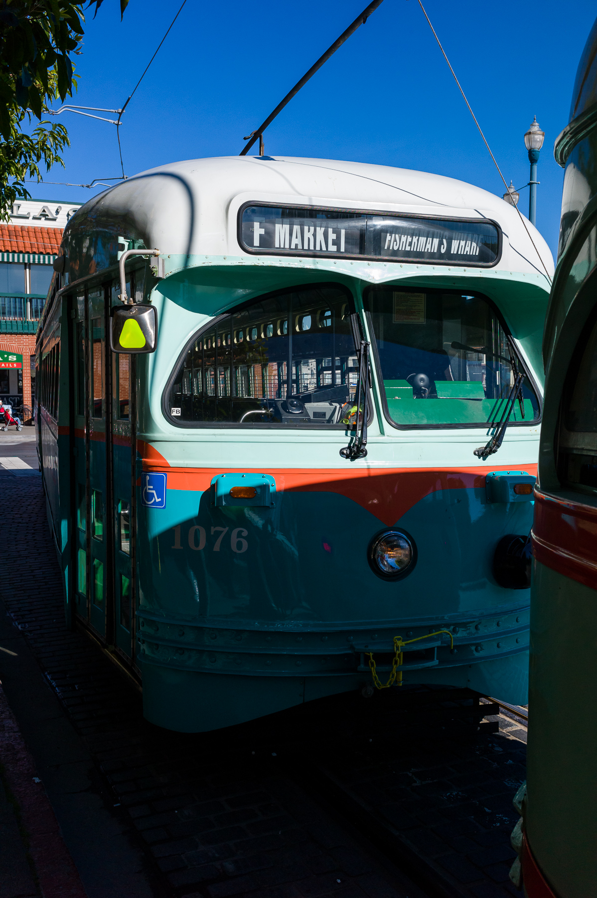
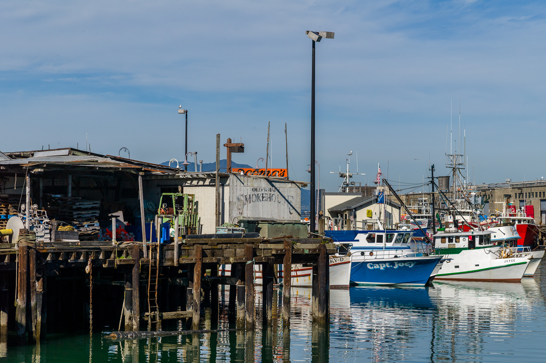
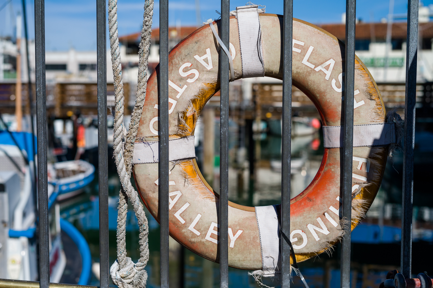
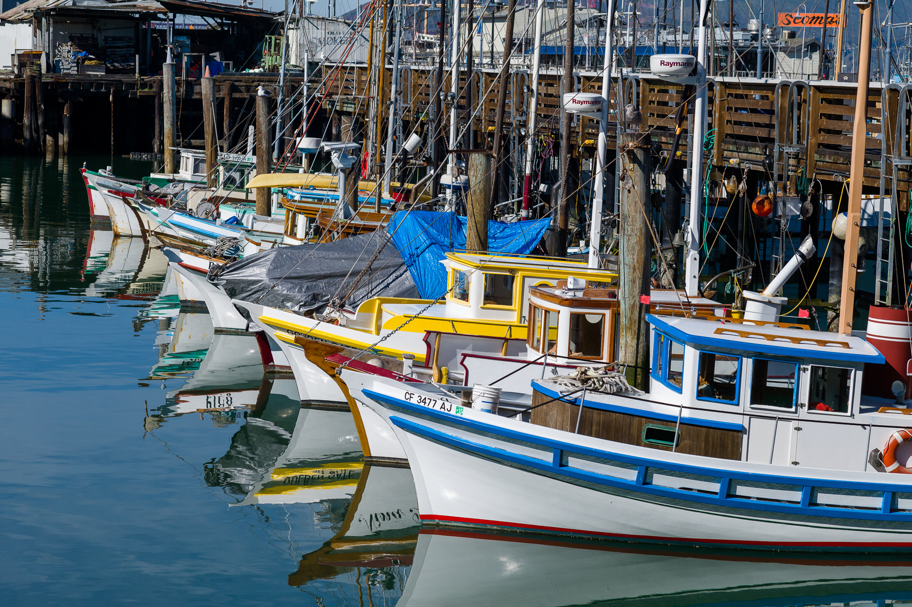
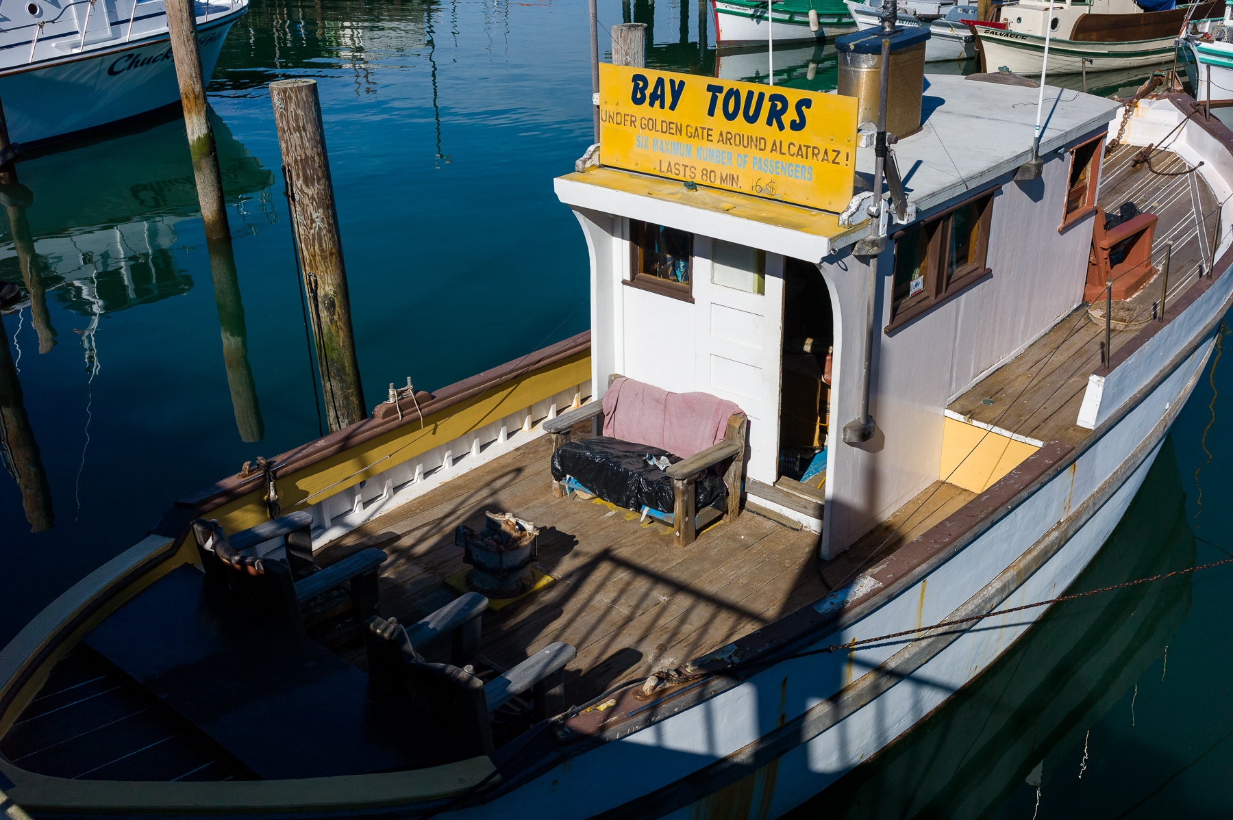
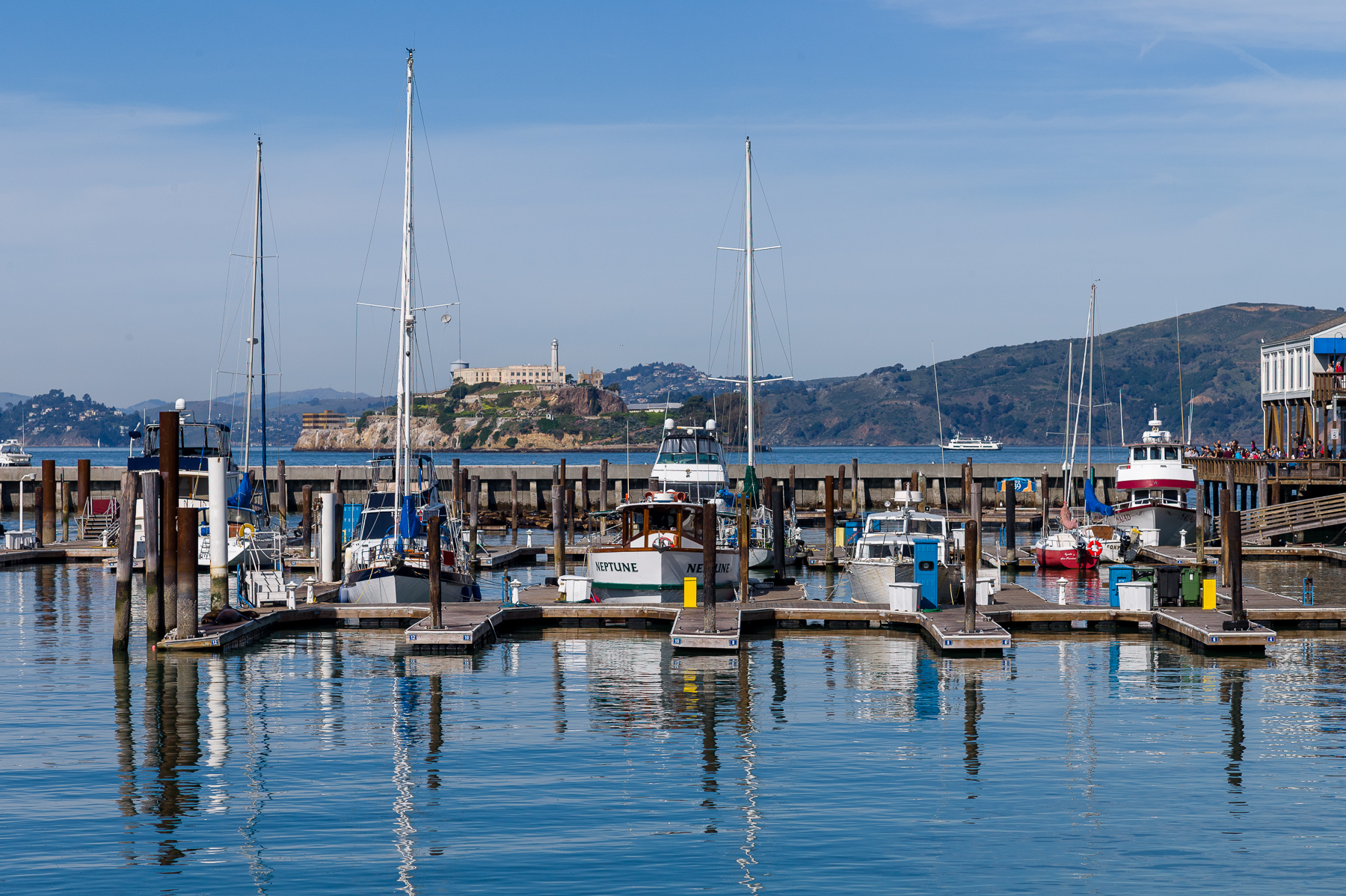
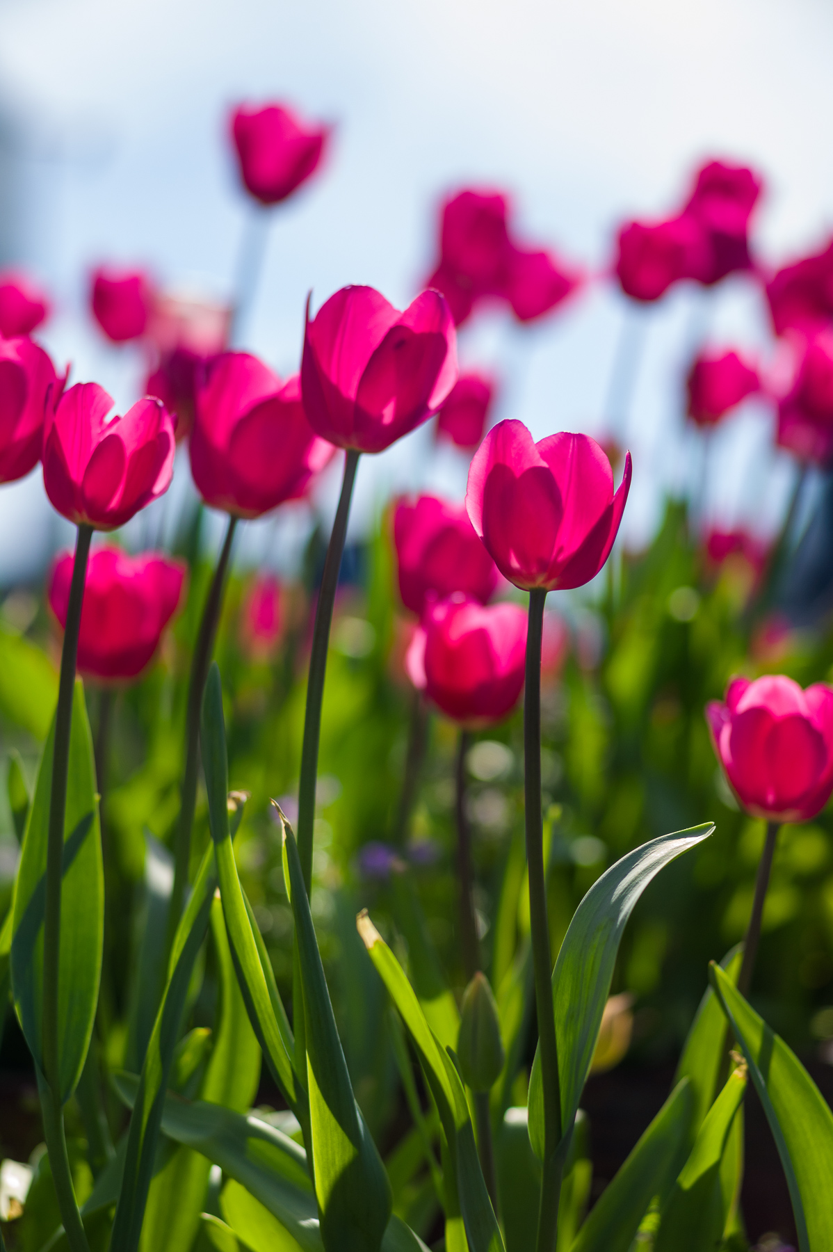
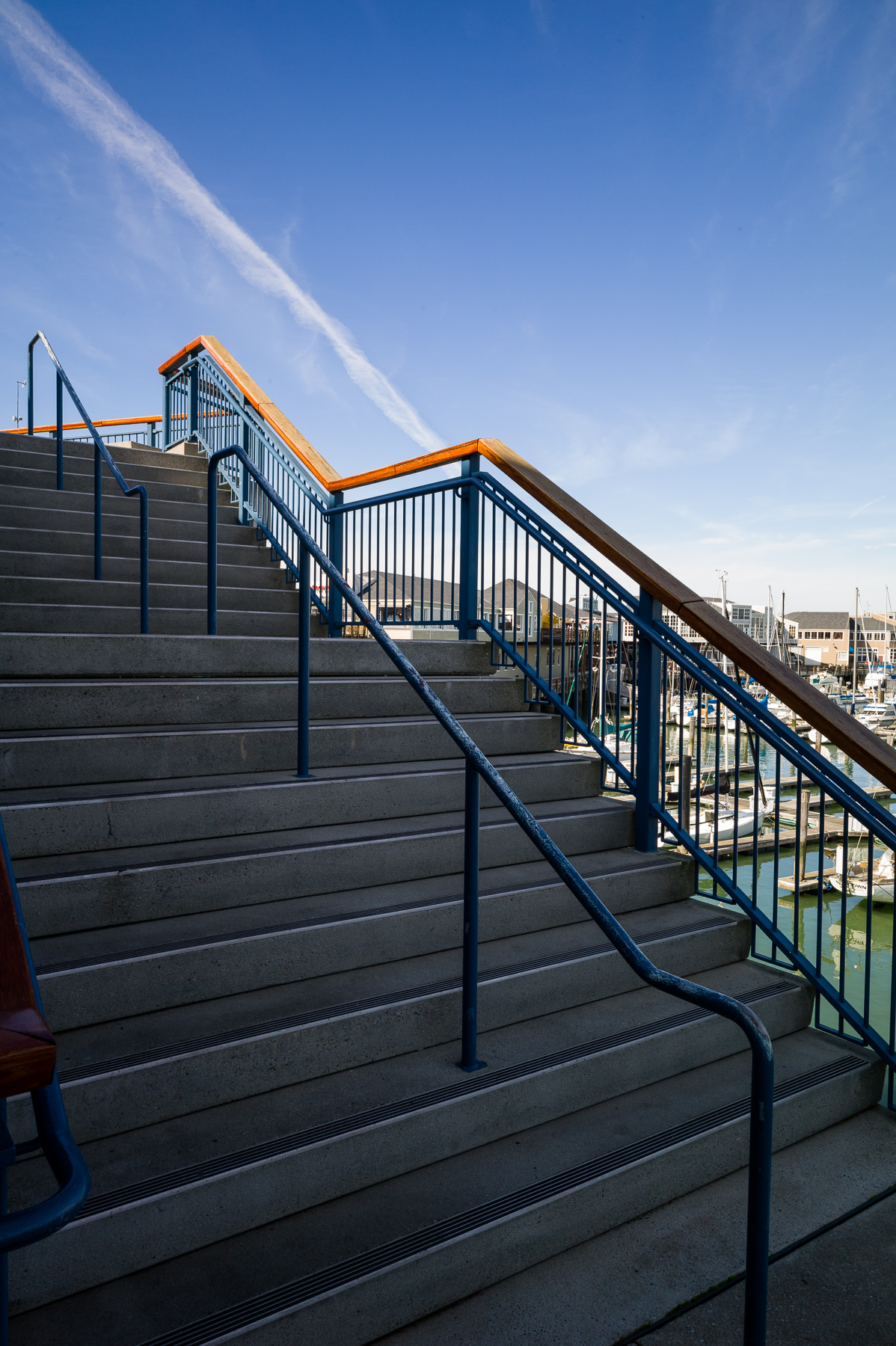
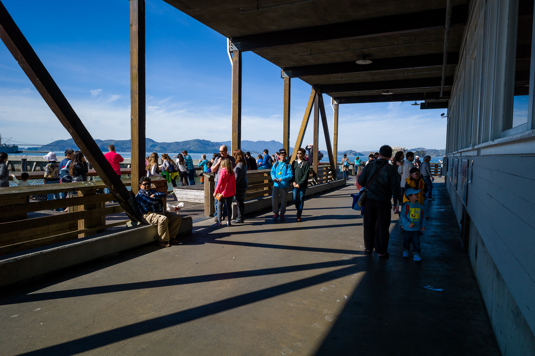
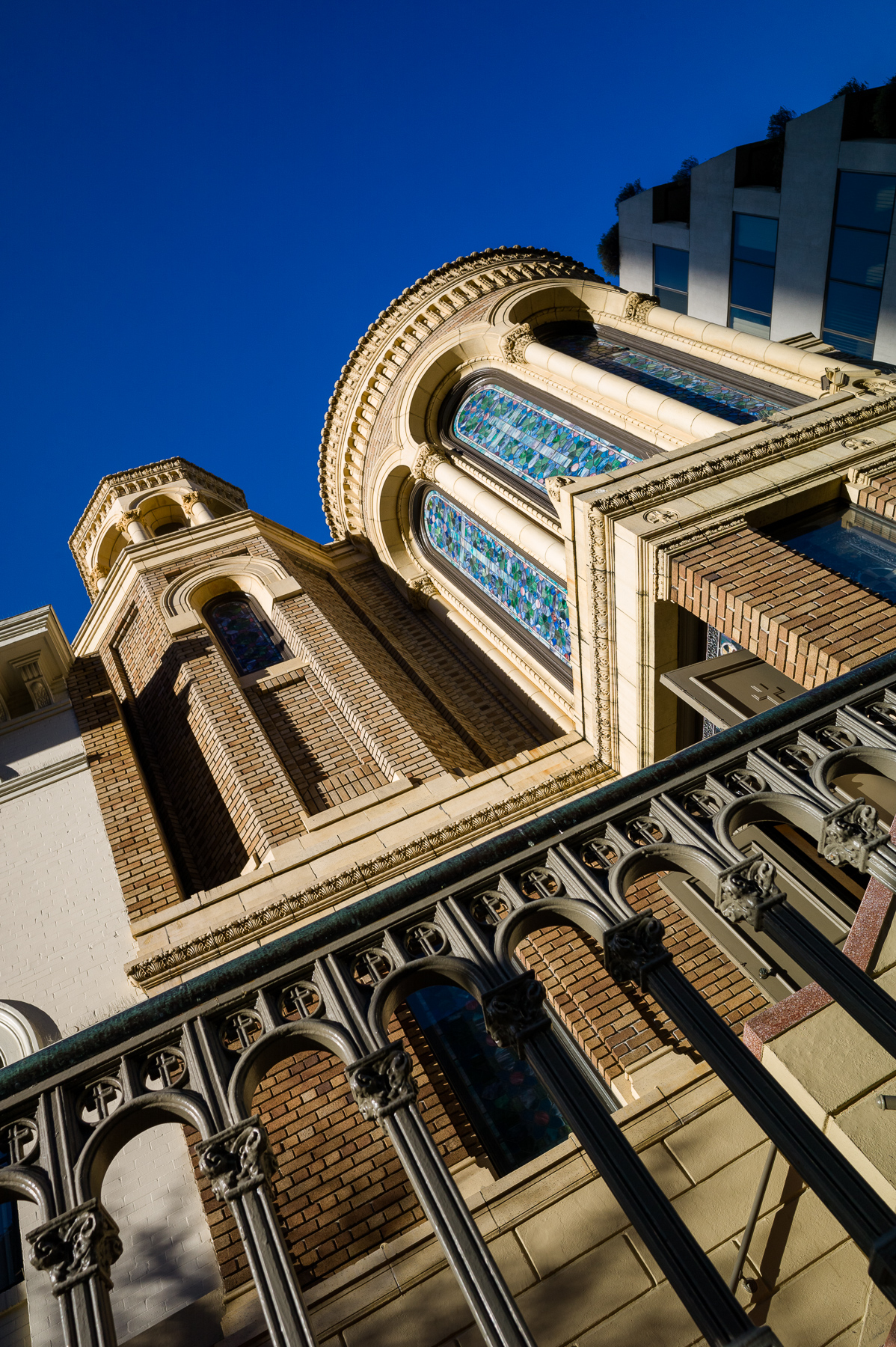
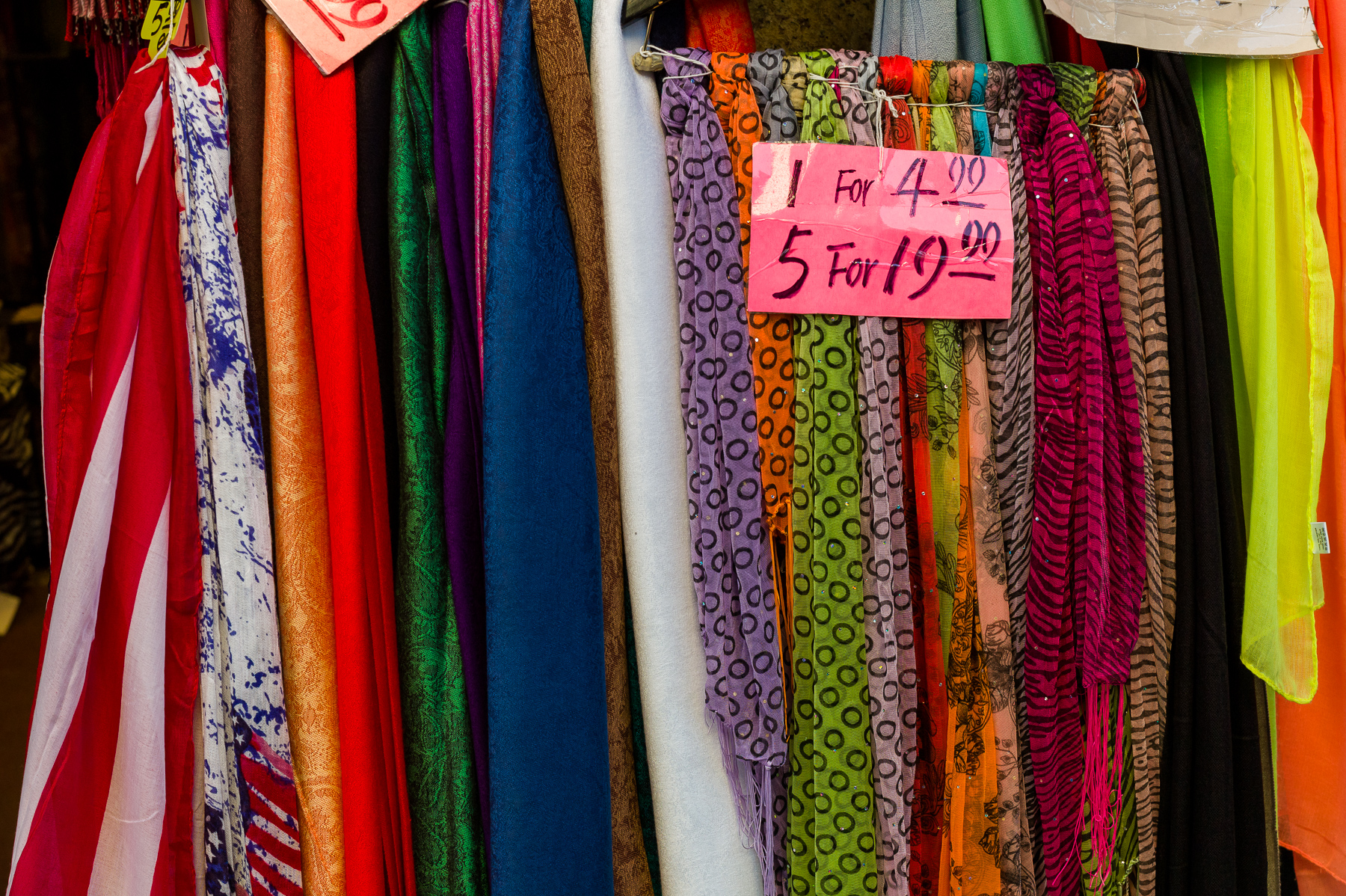
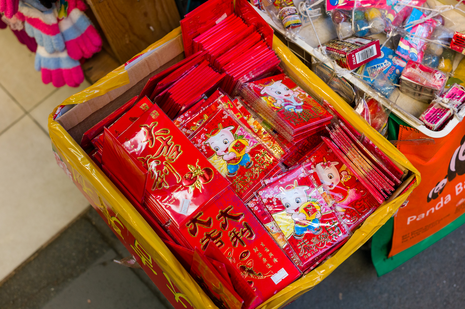
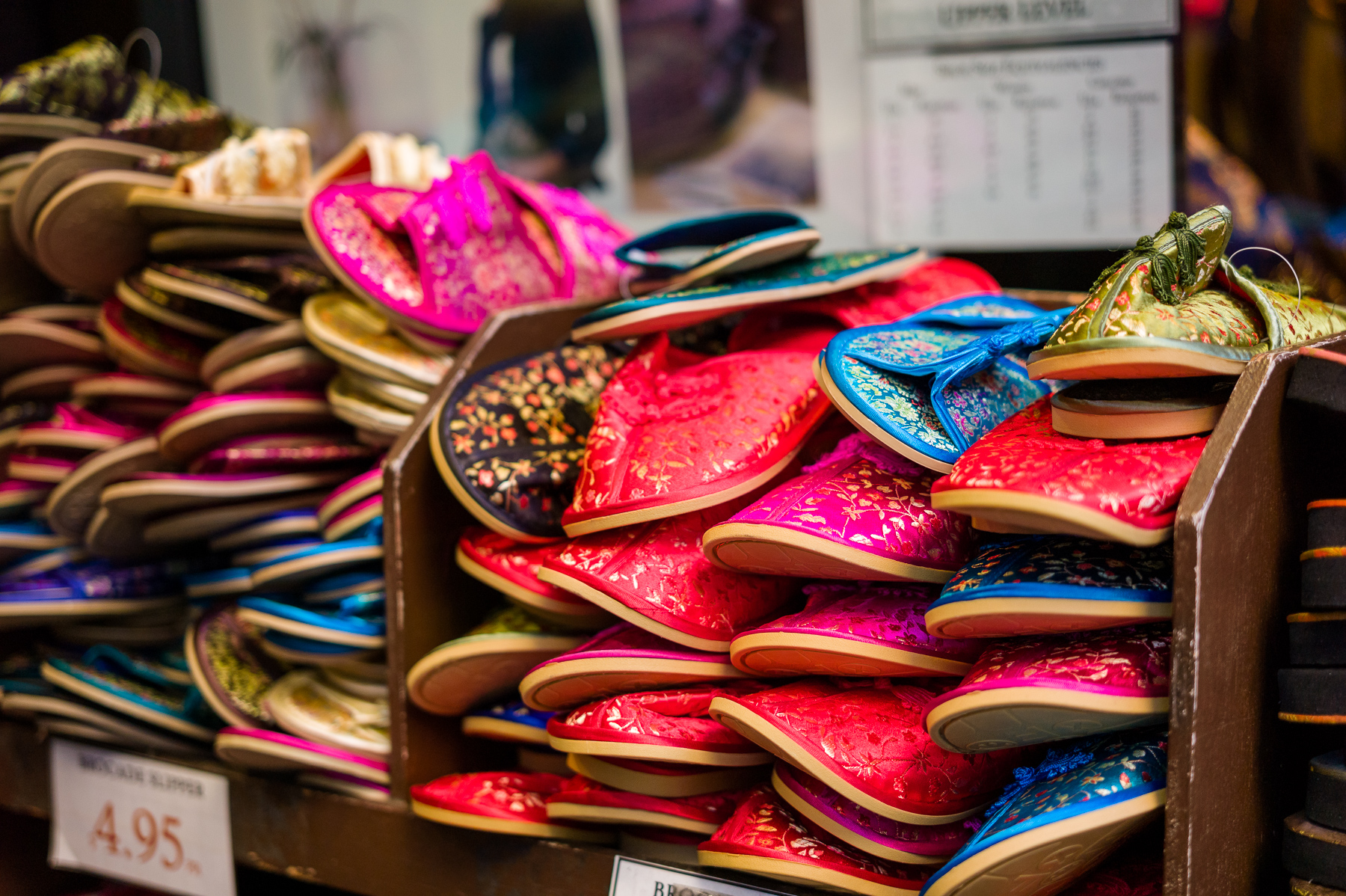
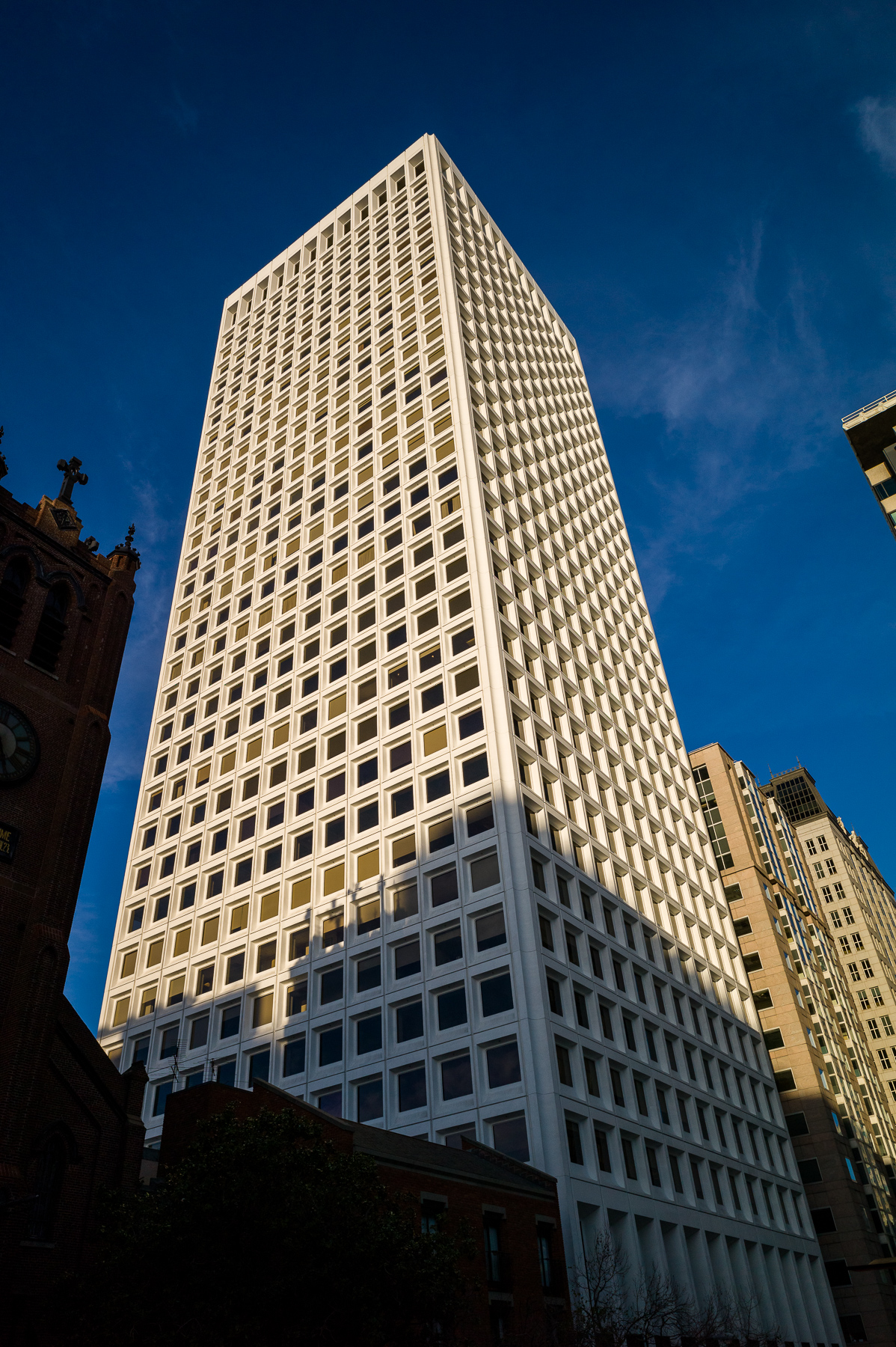
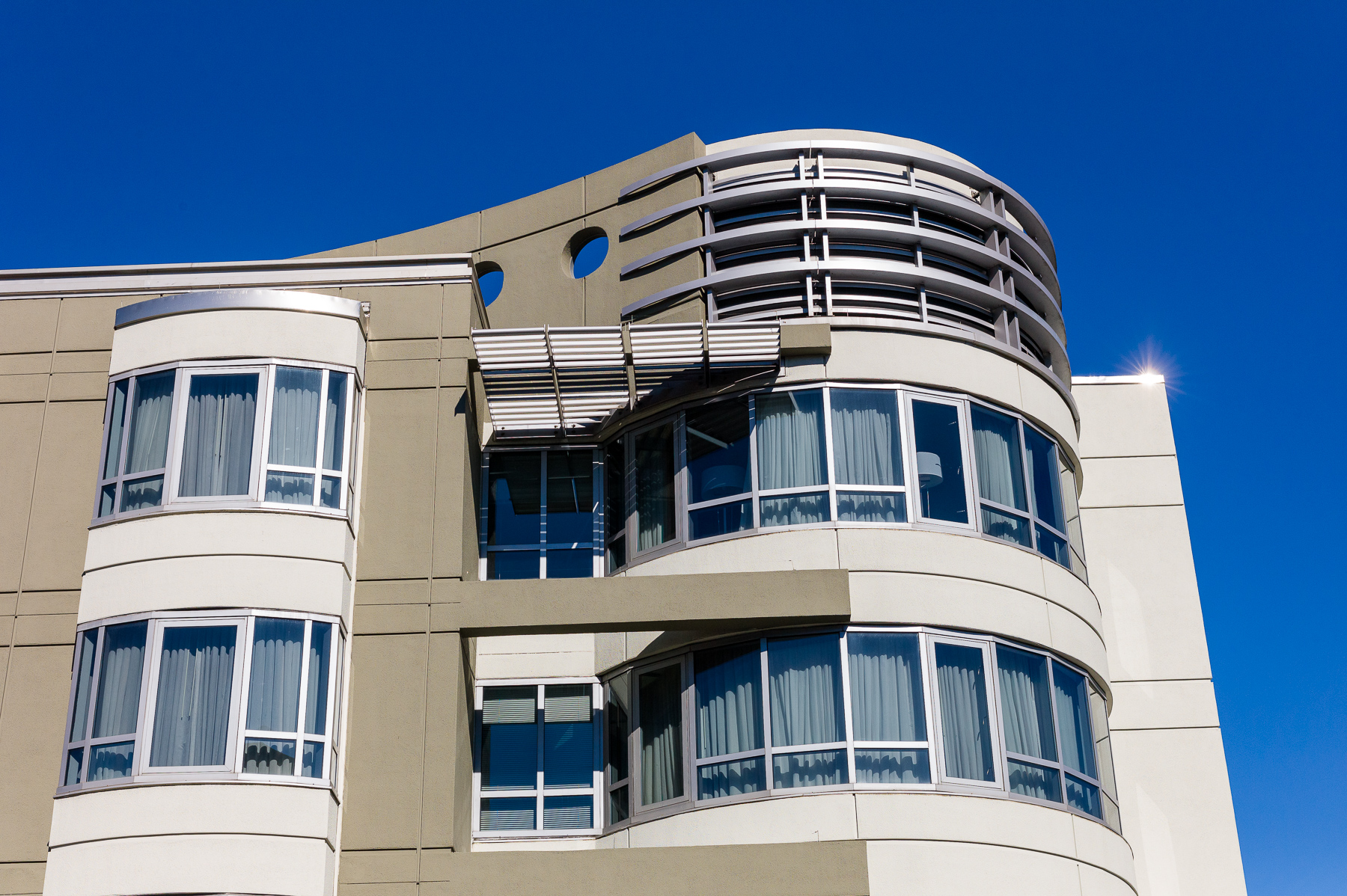
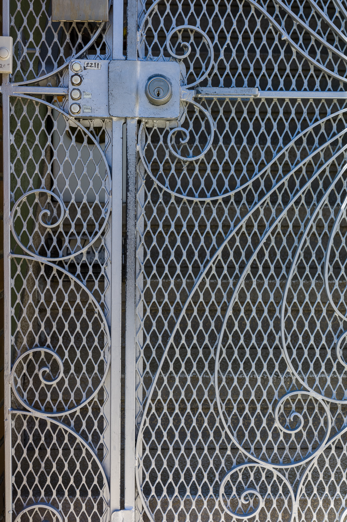
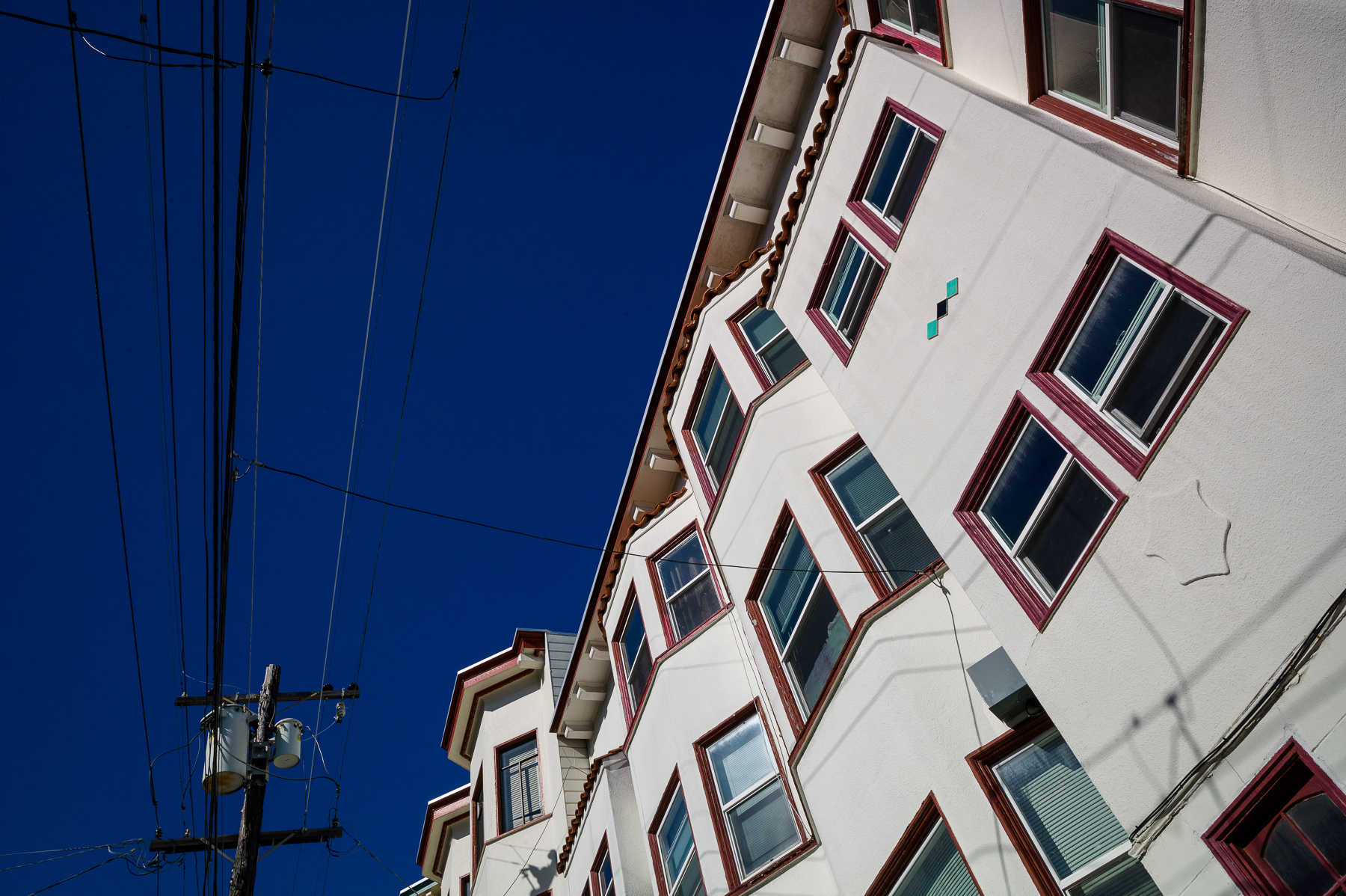
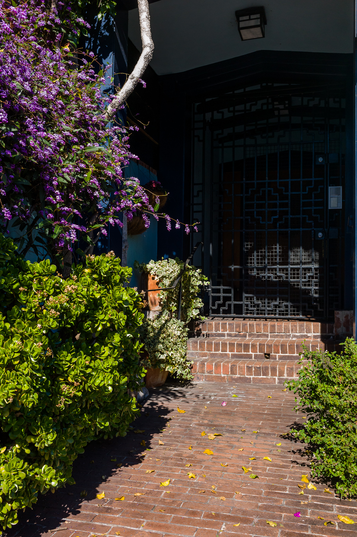
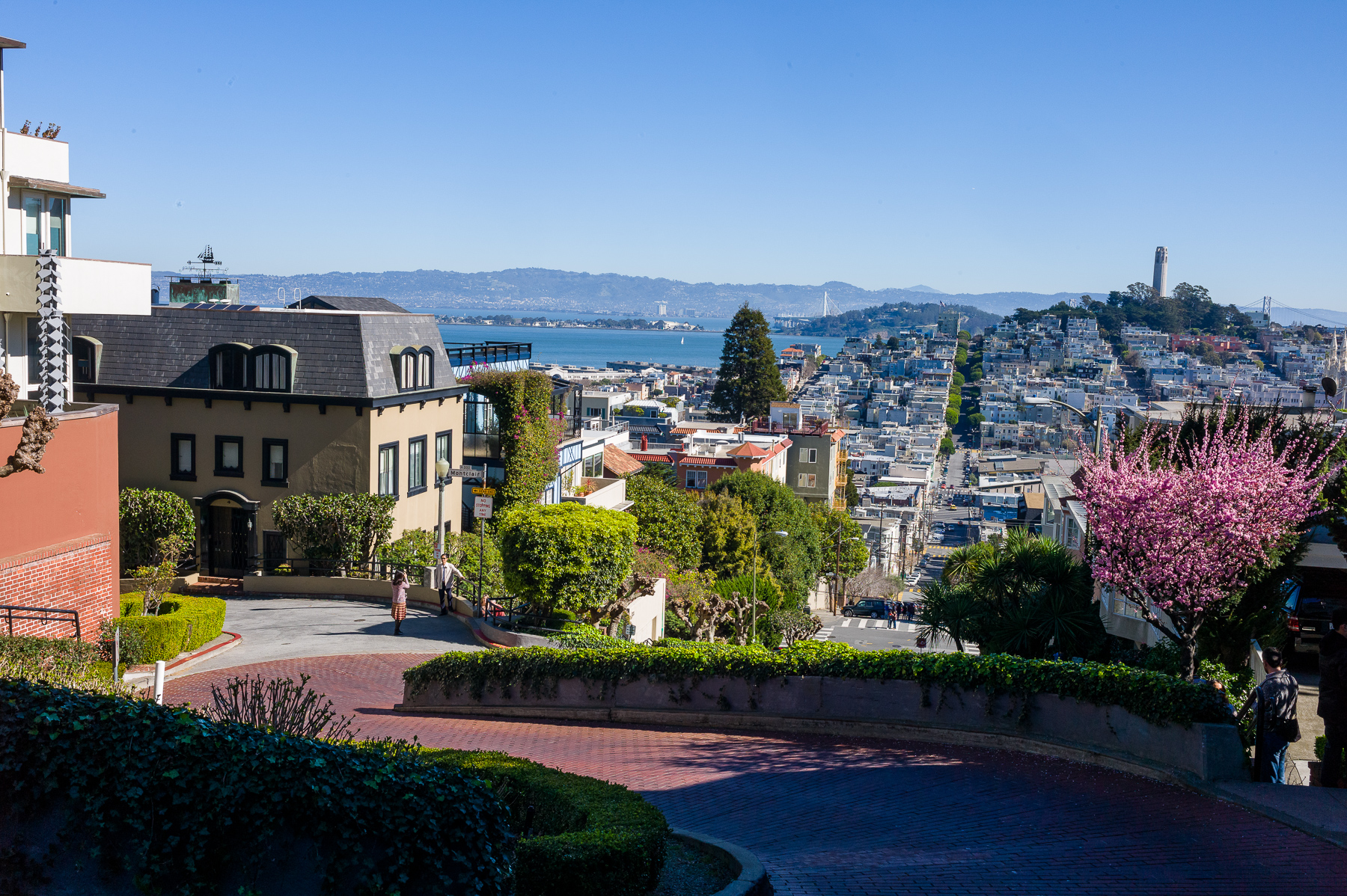
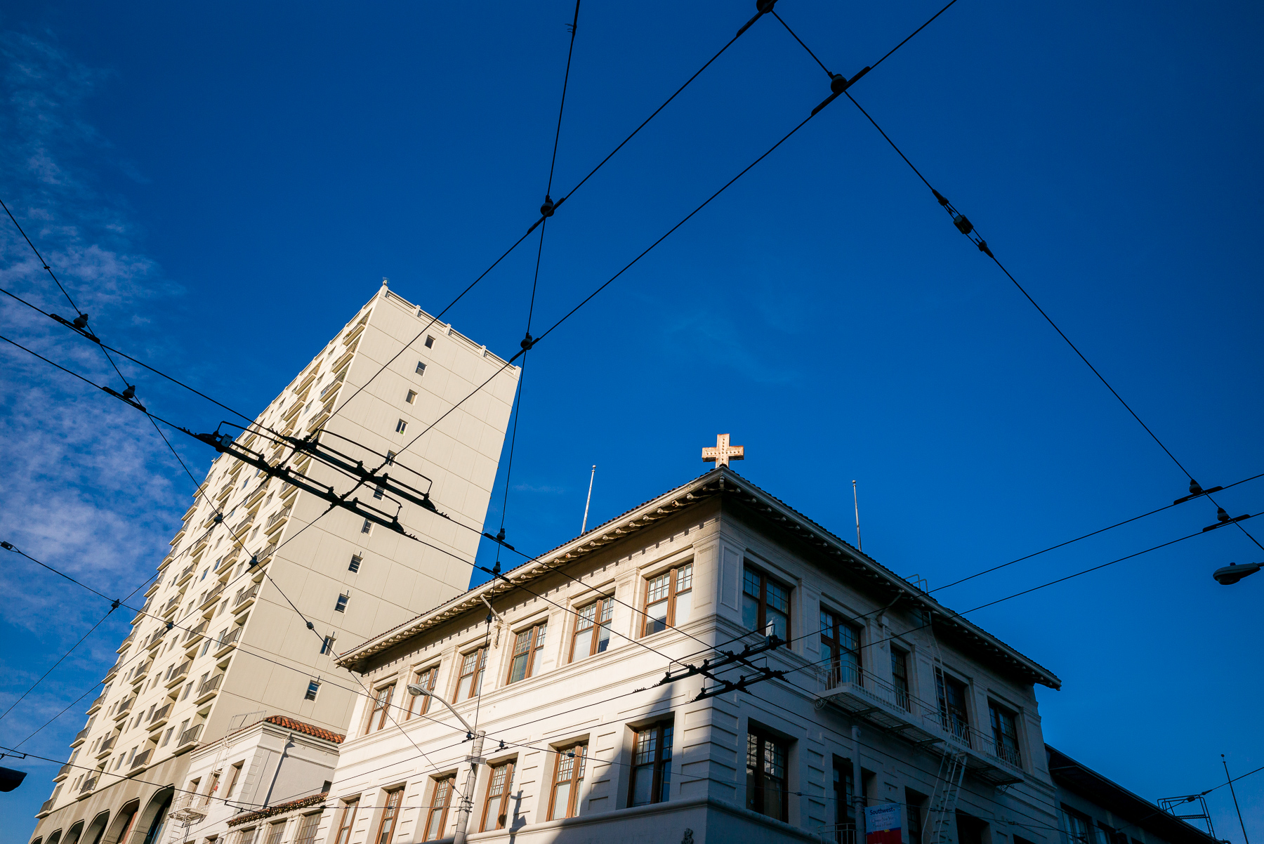
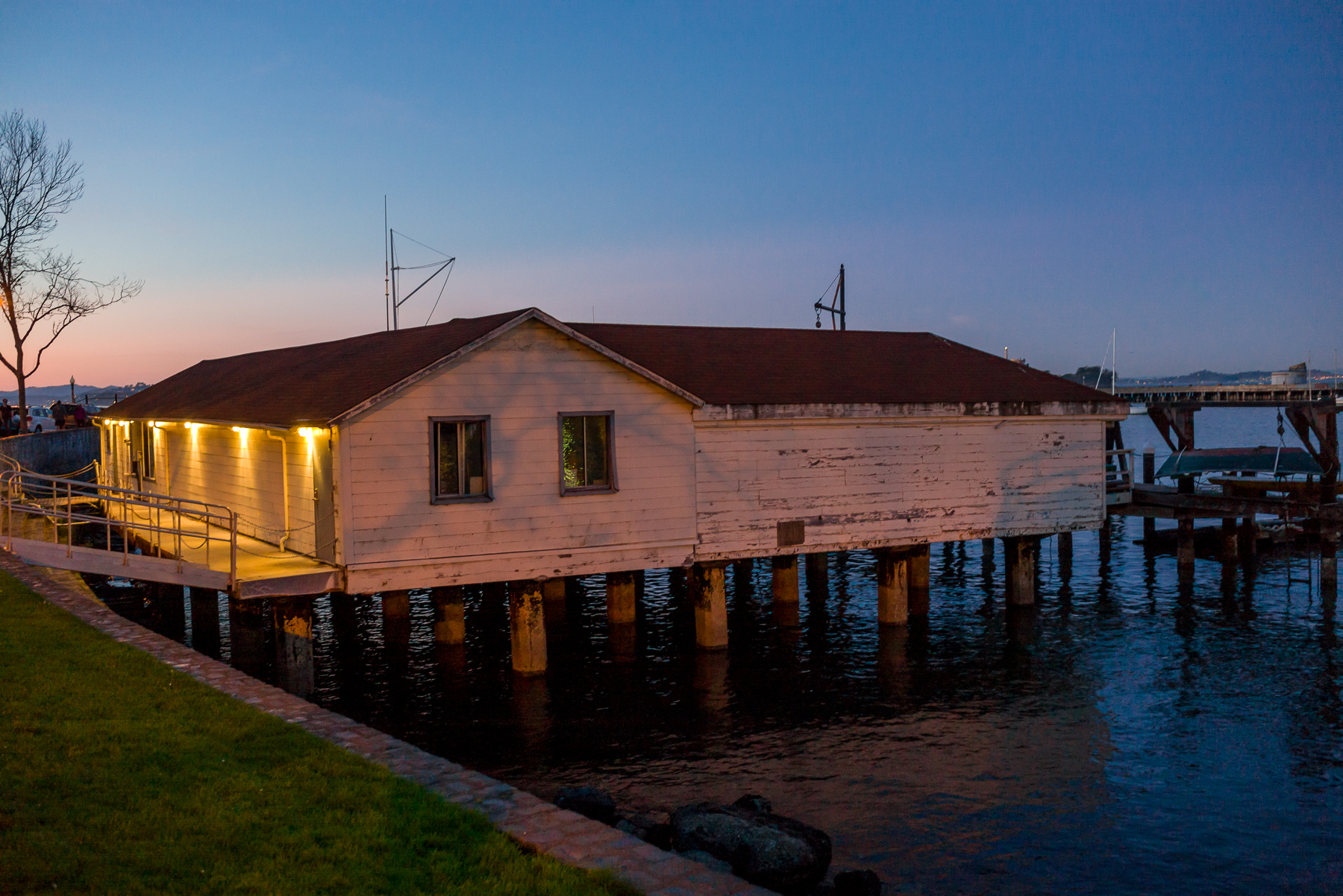
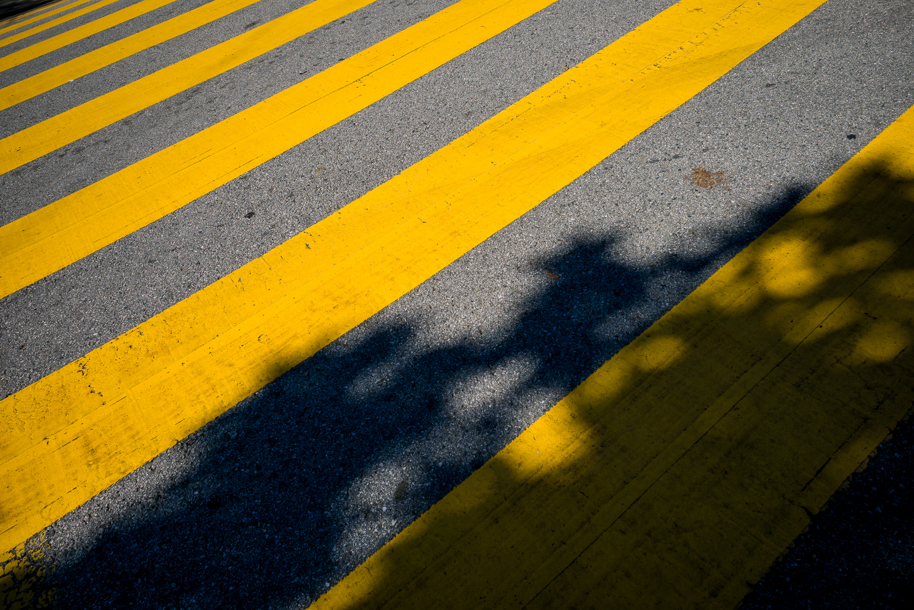

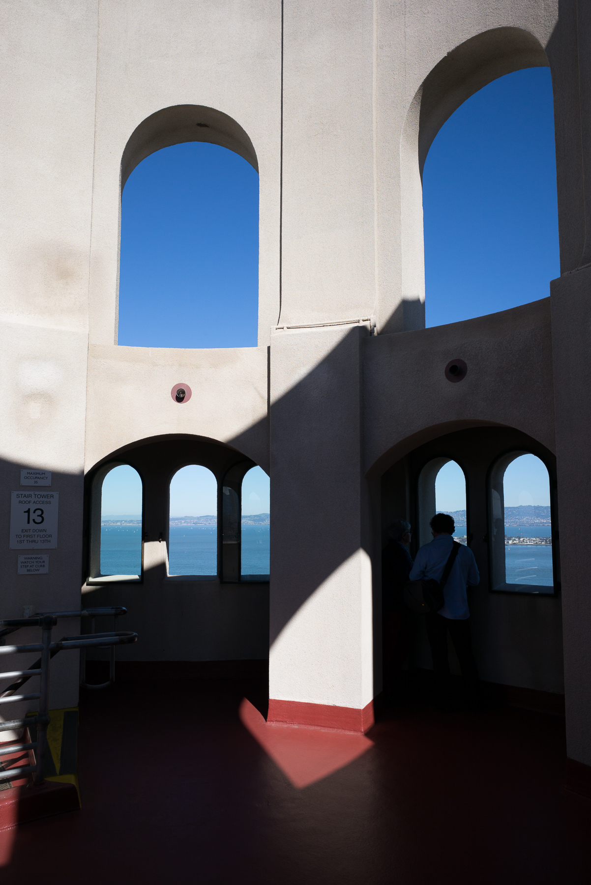
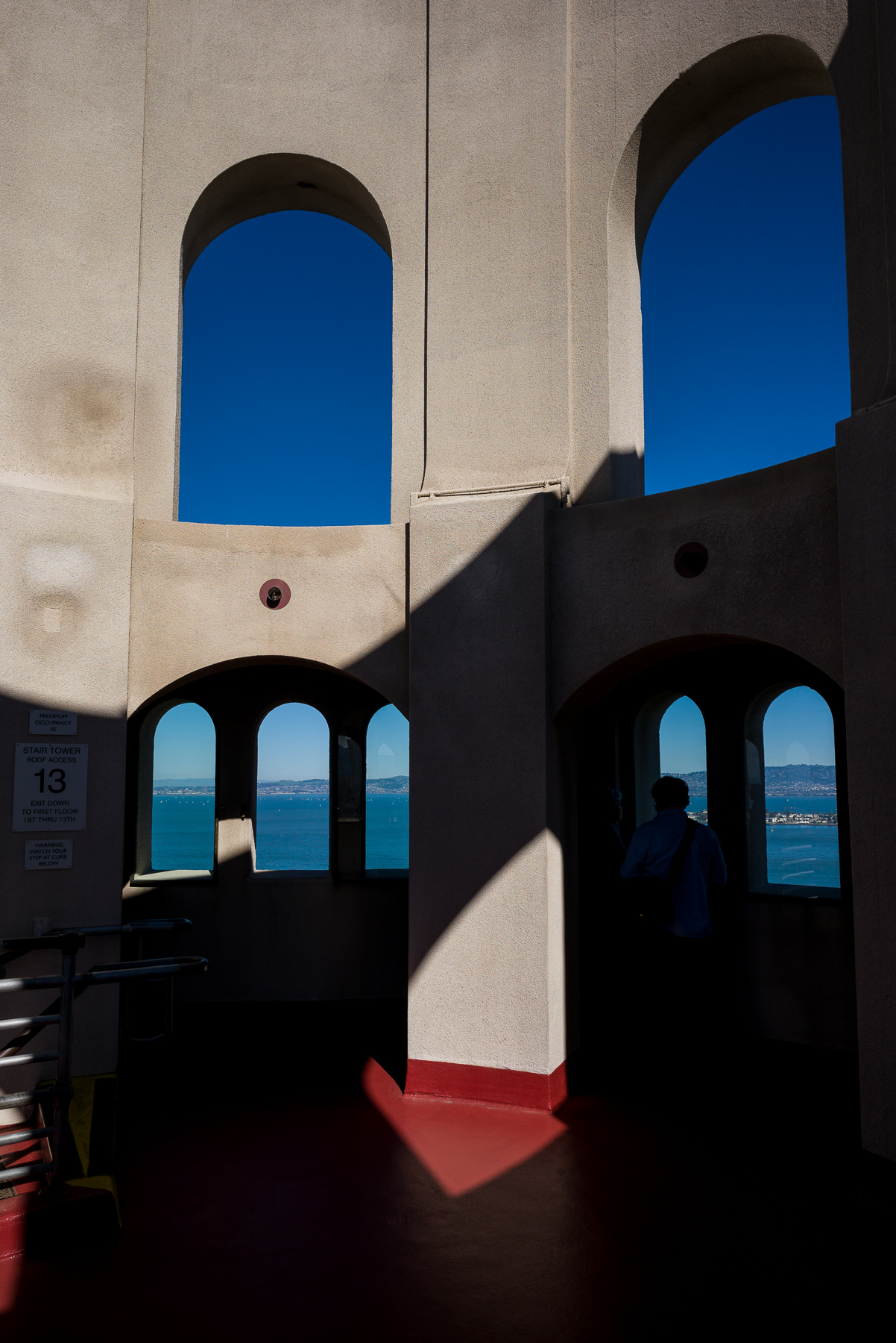
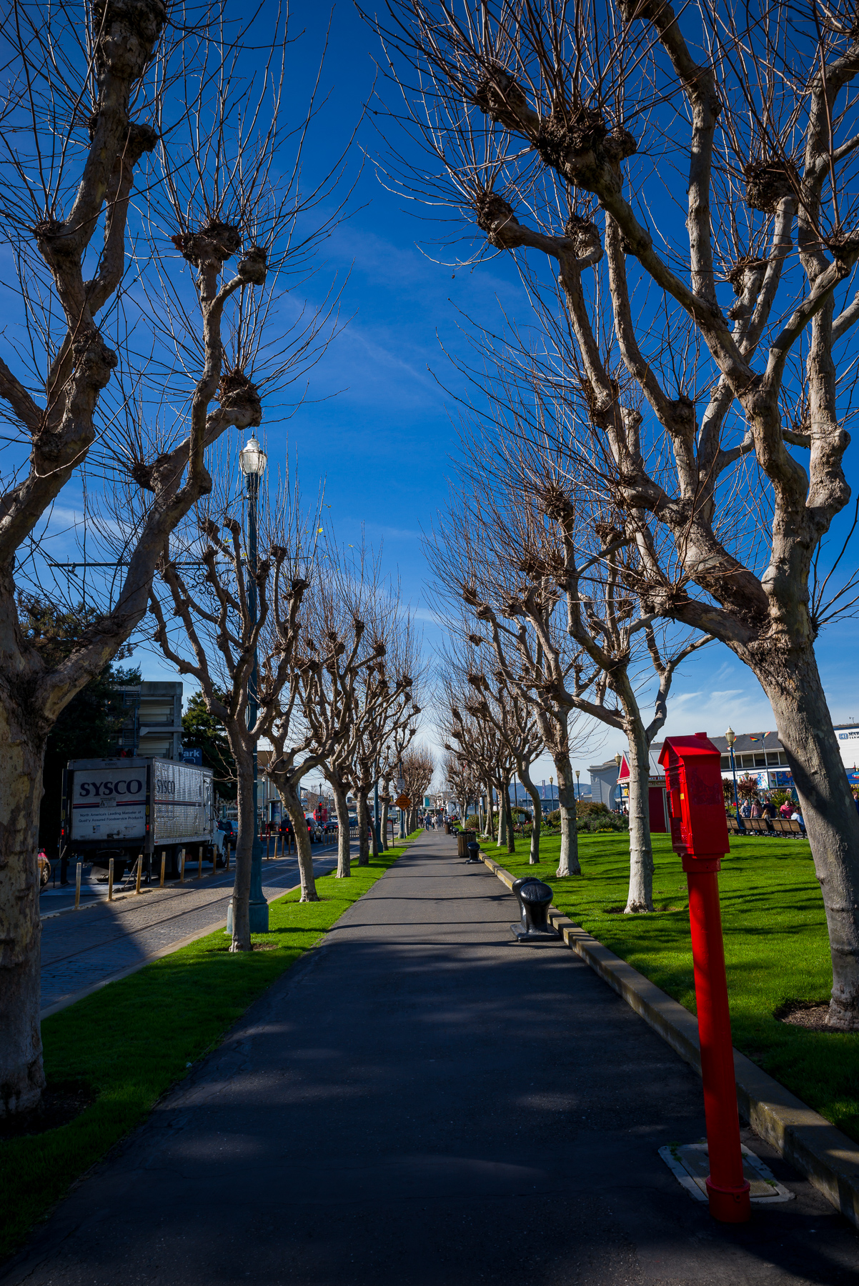
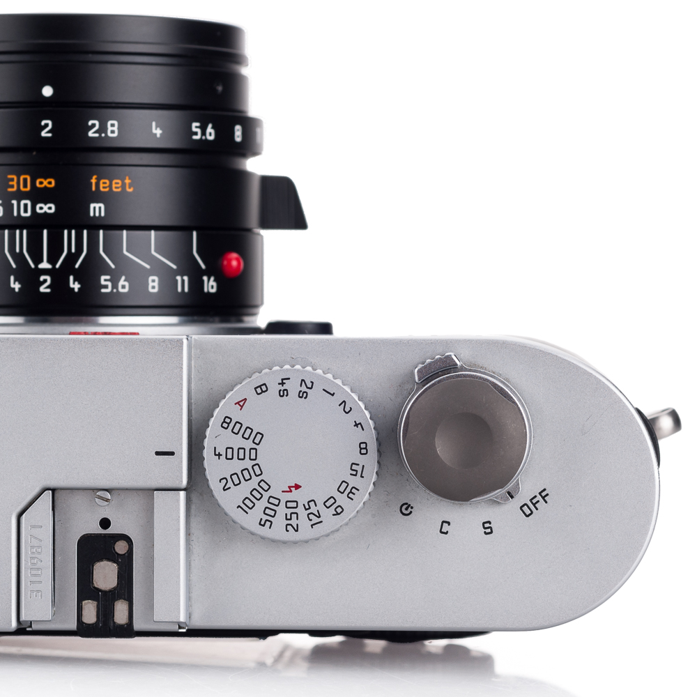
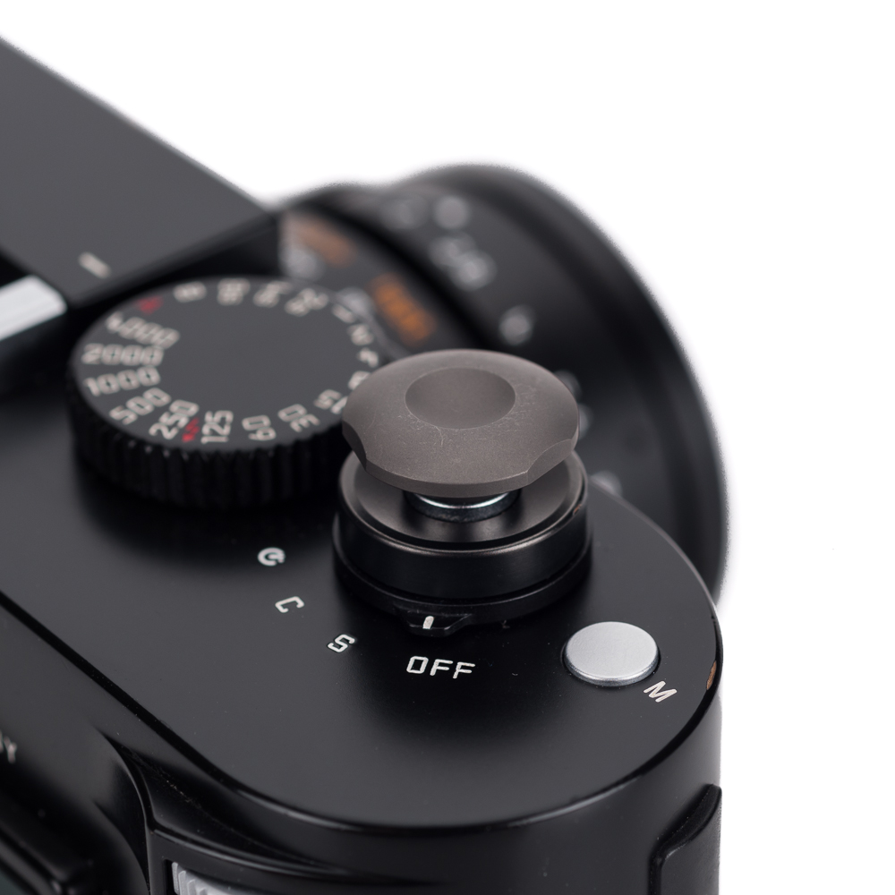
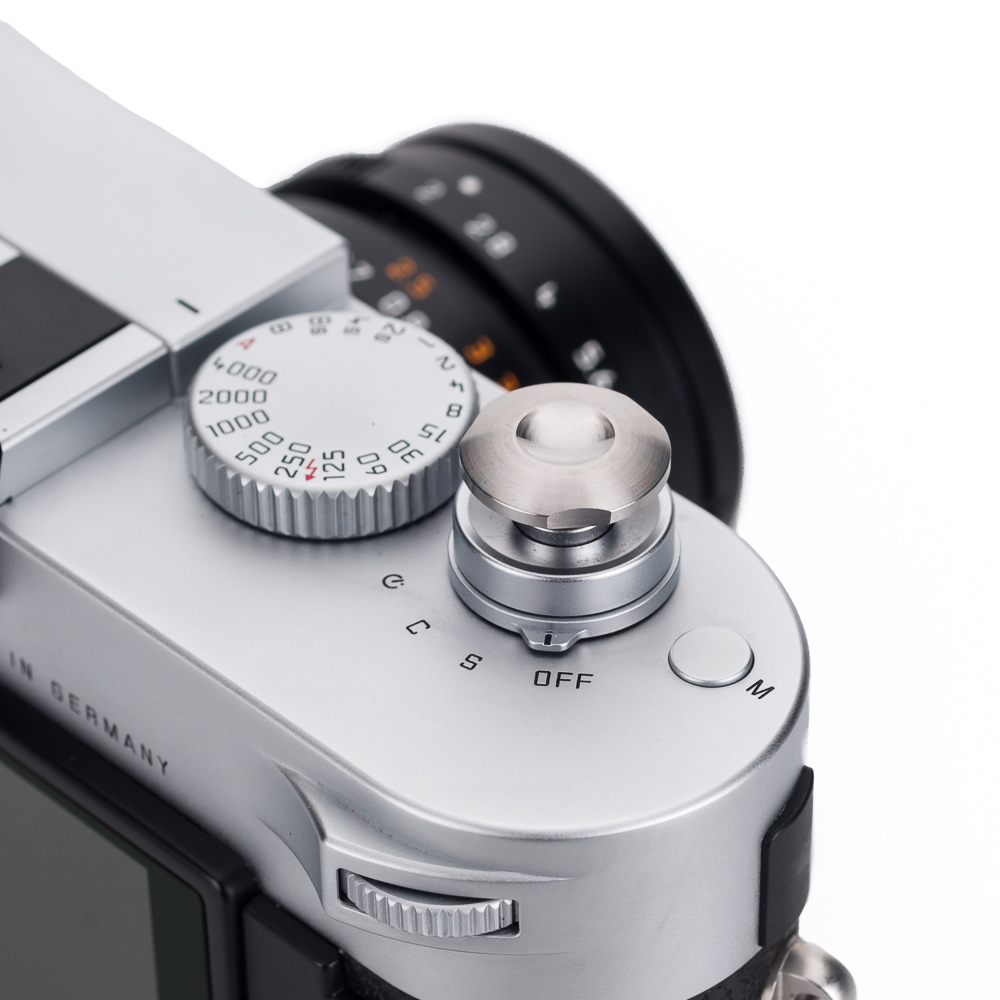
The Q sure feels like a game changer to me. It was too easy for me to place my order as this checks all of the boxes for me. I will always own an M and I cannot see anything taking it's place but this will be such a nice addition to my setup.
Great review David!
Thanks for the thorough (and enjoyable: great images!) review David. The Q seems to begin to address many of the shortcomings of the current M246 (low pixel EVF, not-so-great high ISO performance, shutter lag when using the EVF to name a few of my nits).
I am wondering if the Q has the ability, when you magnify the EVF view 3x or 6x, to choose where in the frame the magnified view is. This would be pre-exposure. Another one of my nits with the current M240.
Thanks very much again!
In the current Q firmware, you cannot move the magnified focus point. Given that the S007 running the same Maestro 2 processor will support this feature, a future firmware update might allow it. We'll have to see.
Panasonic makes some great cameras in collaboration with Leica (ex: the D-Lux), but the Leica Q does not seem like a tie-in with Panasonic, for the M-type body if nothing else.
I had the Monochrom and new Noctilux for about 6 months, and while it's a great combo, the primary reason to carry such a heavy and expensive piece of glass is the f0.95 aperture. But that aperture has an extremely small DOF, and unless you dedicate yourself to working with that constraint, you'd be disappointed. My Q doesn't arrive until 3 days from now, but already I have in mind that it will be much like the X Vario I had, at the low end of its zoom range, and somewhat like the Nikon ‘A' but with much better sensor, lens, and processing engine. For someone accustomed to shooting at the 28 mm effective focal length (ex: Nikon ‘A' or X Vario un-zoomed), the Q should be a dream come true.
Thanks for an awesome review, it indeed looks like what I was waiting for all these year, and I placed my preorder today at Leica Philippines, to my surprise the first they had received, the official launch here is next week on Friday 21st
Image quality on both M240/28 Lux and the Q will be quite good and fairly comparable. I haven't done any head to head testing yet, but I did just wrap up a workshop in Berlin where I shot with both cameras side-by-side. The results in LR are mixed together and match up very nicely.
The real advantage of the M is the flexibility to use other focal lengths, like the 50 APO that you have. On the other hand, the Q offers fast AF and macro capability.
I am not one for pre-post quality evaluations. In my mind, every file requires at least some basic post processing, just as even the finest quality food ingredients require some seasoning by the chef.
No, this is a pure Leica product. My understanding is that Panasonic's involvement was limited to specific components, such as AF and OIS.
Interesting idea on the electronic shutter. The leaf shutter is so quiet and introduces so little vibration, I'm not sure if there would be any advantage here.
As far as the ad-hoc connection, this is already available. A QR code on the camera's LCD is generated when using “Host” mode WLAN setup. Scan the QR code with the Q App on your phone or iPad and it sets up its own connection. Very simple.
I had the M9 + Noct combo for three years. Setting aside the price aspect, the Noct is a great lens at f5.6 and an amazing lens at f.95. However, at f.95, the Noct is very hard to focus and even more difficult in low light… the depth of field is so shallow (focus on the bridge of someones nose and their lips are out of focus) that for me focus success was very hit and miss.
But if you use the Noct with the M240 and the not-so-great EVF (too low resolution, in my opinion, a better EVF is the one for the T), then you will greatly increase your odds of low-light focus success with the Noct.
I also once bought into the CCD in the M9 being better than the CMOS in the M240. After using both and the M240 for 18 months, I think overall the M240 files have a little more “play” in them… less susceptible to banding, particularly in well saturated skies.
I did use the lens profile for the 28mm Summicron-M ASPH in Lightroom, since the Q hasn't been added to the lens database yet.
Thank you for the nice feedback. I do basic edits to taste in Lightroom after applying a preset to my images upon import. I probably spend a minute or two per image.
I'm not quite sure what you mean “change from right to left”. Could you elaborate?
Hi David, I believe he's trying to change the light meter/exposure compensation displays from
-3 -2 -1 0 1 2 3 to
3 2 1 0 -1 -2 -3